Tawazon

2021
Damascus, Syria
the inspiration
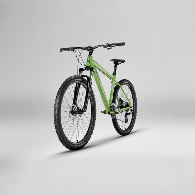
The initial conceptual anchor for the Tawazon project brand is the bicycle. This ubiquitous vehicle, known for its dependency on perfect balance (the literal definition of "Tawazon") and its universal accessibility, serves as a powerful metaphor for the social and economic mobility the project strives to facilitate. The core inspiration images capture the structured symmetry of the wheels and frame.
tawazon01
tawazon02
geometric breakdown (logo cutout)
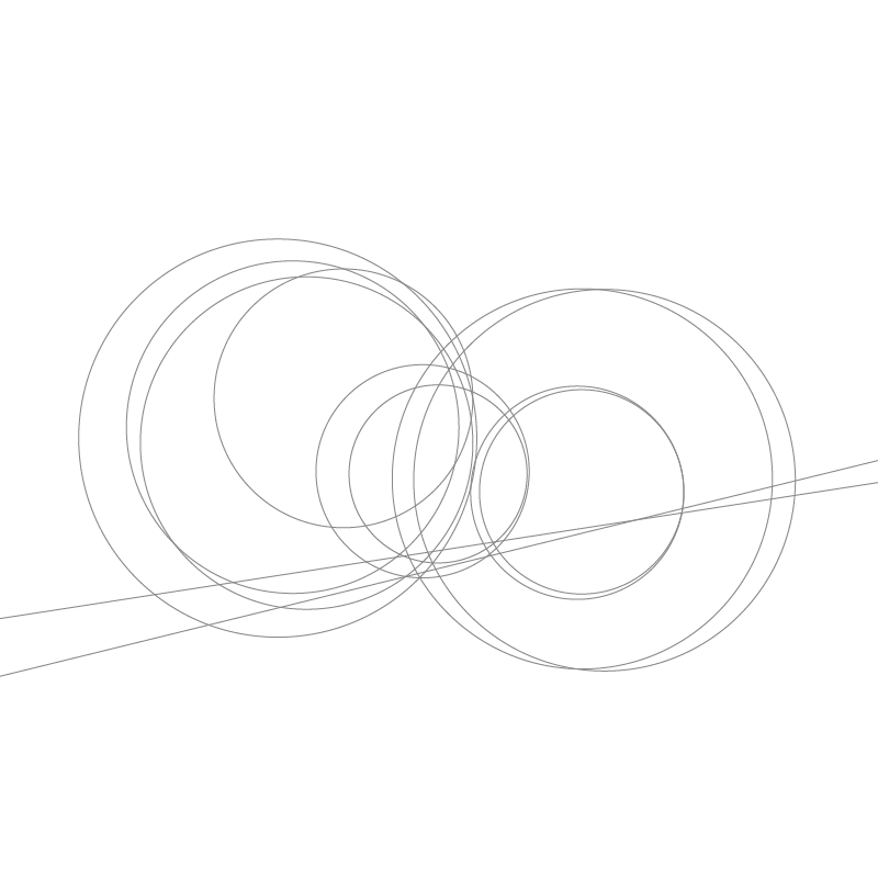
To transition from the literal to the conceptual, the design process deconstructs the geometry of the inspiration. This intermediate step involves a schematic 'cutout,' isolating the intersection of wheels and frame tubes. The intersecting arcs of the wheels form the primary motif, which is refined into an essential, balanced line-art structure, removing all clunky or fine, unnecessary details for a clean foundation.

the final "balance"
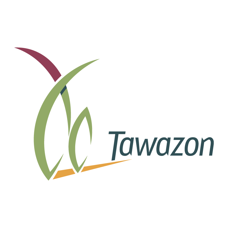
The finalized emblem takes the refined arcs of the bicycle metaphor and seamlessly integrates the initial letter "T" from Tawazon into its structure. These curves are stylized into two flowing, upwardly mobile abstract forms that intersect perfectly over a horizontal anchor—echoing both the structural frame of a bike and the sweeping geometry of the letterform itself. This elegant mark symbolizes harmony, partnership, and stable momentum. The upward trajectory represents growth and optimized capabilities, while the horizontal balance point grounds the logo in stability and equality. The overall design remains harmonic, balanced, and elegant.
tawazon03
tawazon04
the color palette
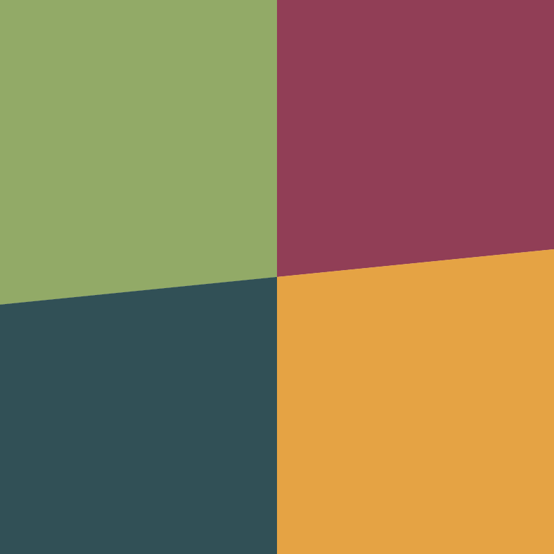
The color palette reflects the project's ambition: calm and feminist, but not cliché or predictable; energetic and inclusive. Deep Mulberry & Sage Green: Provide a grounded, calm base, blending professionalism with a touch of sophisticated natural energy (feminist and energetic). Warm Mustard & Slate Teal: Introduce vital energy and balanced dynamism, ensuring the brand feels inclusive and active.
logo motion & 8-second loop breakdown
To bring the brand identity to life across digital platforms, the logo animation translates the visual concept into a fluid, continuous 8-second motion loop. The choreography directly mirrors the transformation from the physical mechanics of a bicycle into the project's abstract mark of balance and growth.
8-second sequence unfolds in three distinct movements.
Tawazon005

Tawazon

2021
Damascus, Syria
the inspiration
The initial conceptual anchor for the Tawazon project brand is the bicycle. This ubiquitous vehicle, known for its dependency on perfect balance (the literal definition of "Tawazon") and its universal accessibility, serves as a powerful metaphor for the social and economic mobility the project strives to facilitate. The core inspiration images capture the structured symmetry of the wheels and frame.
tawazon01
geometric breakdown (logo cutout)
To transition from the literal to the conceptual, the design process deconstructs the geometry of the inspiration. This intermediate step involves a schematic 'cutout,' isolating the intersection of wheels and frame tubes. The intersecting arcs of the wheels form the primary motif, which is refined into an essential, balanced line-art structure, removing all clunky or fine, unnecessary details for a clean foundation.

tawazon02
the final "balance"
The finalized emblem takes the refined arcs of the bicycle metaphor and seamlessly integrates the initial letter "T" from Tawazon into its structure. These curves are stylized into two flowing, upwardly mobile abstract forms that intersect perfectly over a horizontal anchor—echoing both the structural frame of a bike and the sweeping geometry of the letterform itself. This elegant mark symbolizes harmony, partnership, and stable momentum. The upward trajectory represents growth and optimized capabilities, while the horizontal balance point grounds the logo in stability and equality. The overall design remains harmonic, balanced, and elegant.
tawazon03
the color palette
The color palette reflects the project's ambition: calm and feminist, but not cliché or predictable; energetic and inclusive. Deep Mulberry & Sage Green: Provide a grounded, calm base, blending professionalism with a touch of sophisticated natural energy (feminist and energetic). Warm Mustard & Slate Teal: Introduce vital energy and balanced dynamism, ensuring the brand feels inclusive and active.
tawazon04
logo motion & 8-second loop breakdown
To bring the brand identity to life across digital platforms, the logo animation translates the visual concept into a fluid, continuous 8-second motion loop. The choreography directly mirrors the transformation from the physical mechanics of a bicycle into the project's abstract mark of balance and growth.
8-second sequence unfolds in three distinct movements.
Tawazon005