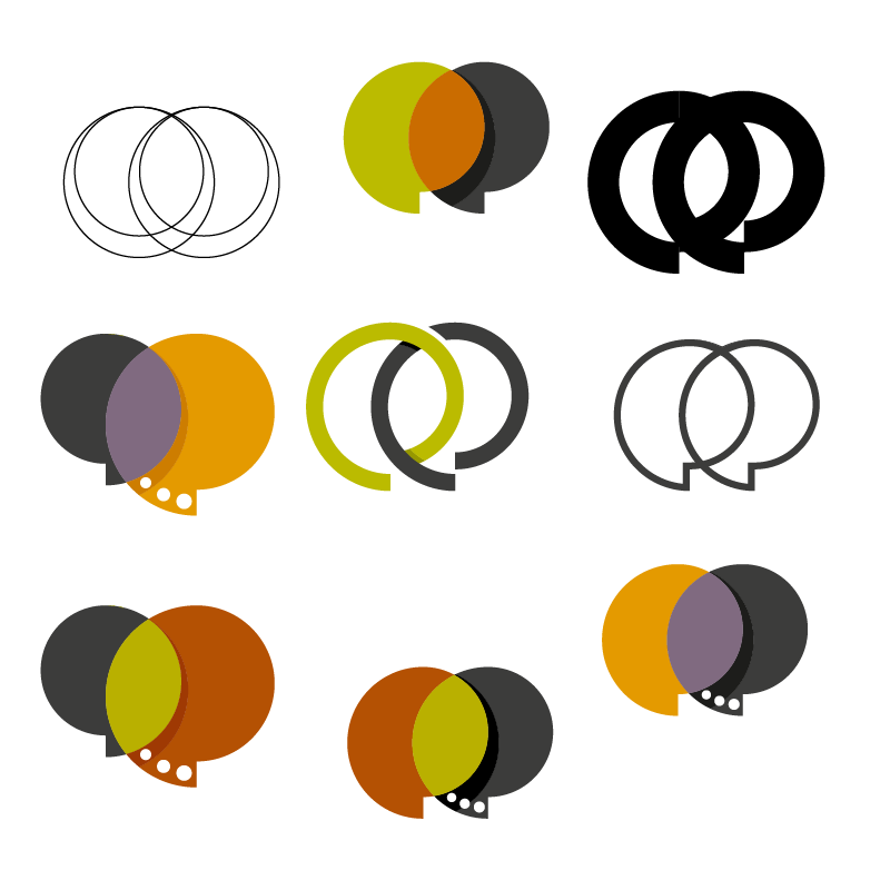
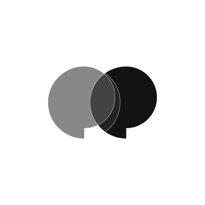
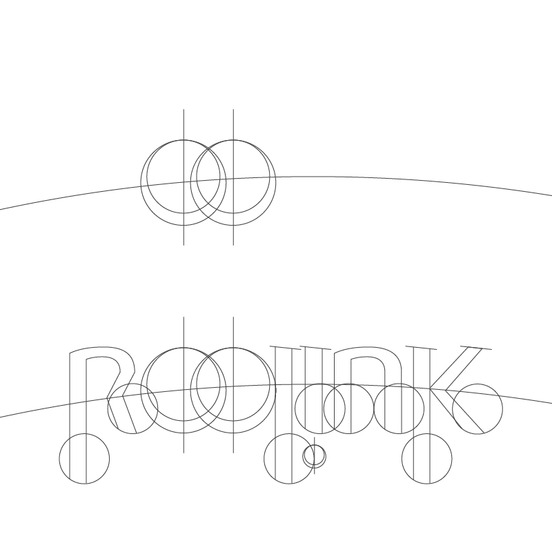
The motion design for Reelink Media centers entirely around the interactive relationship between the two distinct "e" letterforms. Positioned at the core of the wordmark, these elements act as both narrative speech bubbles and the functional connection that defines the company's name.
The animation sequence begins with the primary black "R", "l", "i", "n", and "k" letters resolving into place. Next, the vibrant yellow "e" and its dark counterpart slide in from opposite directions, pulsing gently like active conversation nodes. As they meet in the center, their circular forms overlap to create a dynamic translucency effect—visually forming the physical "link" between storytelling, media, and audience. The smooth snap-and-lock motion emphasizes connectivity, communication, and modern digital production.