QMSF

2023
Darmstadt, Germany
inspiration
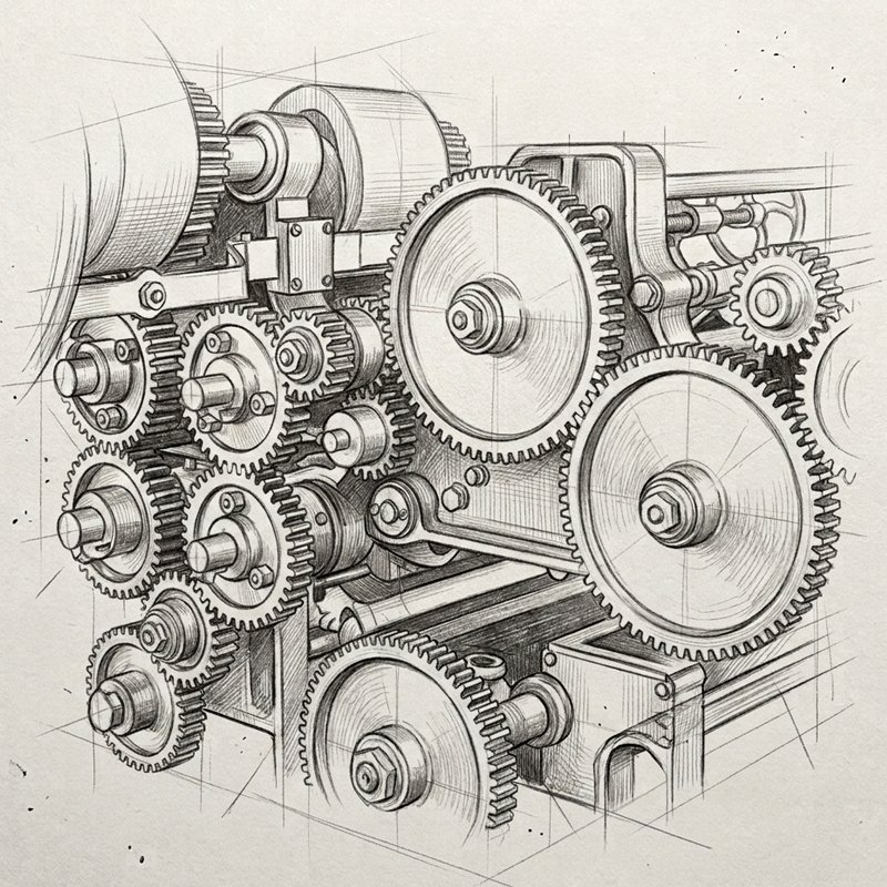
Every strong visual identity begins with a core metaphor. For this project, the conceptual foundation emerged directly from the mission of the Qualification Program for Syrian Professionals in German Development Cooperation. The central motif is the gearwheel—a timeless symbol of industry, collaboration, technical mastery, and structural progress. Syrian professionals bring valuable expertise, drive, and technical skills into a new environment; like a precise mechanism, their contributions power larger systems of development and cooperation. By grounding the visual concept in intricate machinery, the design honors the operational excellence and hard work of the participants. The industrial machinery drawing represents the starting point: translating human skill, engineering, and active participation into a unified symbolic framework that bridges background experience with future professional integration.
qmsf01
qmsf02
sketch breakdown
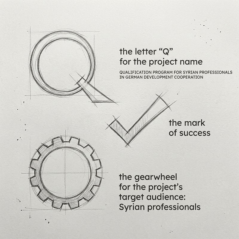
Translating a complex initiative into a clean visual mark requires deconstructing the message into distinct, meaningful iconography. This step breaks down the three foundational components that form the visual identity. First, the capital letter "Q" represents the program's primary title—Qualification—serving as the structural anchor. Second, the gearwheel symbolizes the target audience: skilled Syrian professionals who drive development and technical progress forward. Third, a clean check mark represents achievement, successful qualification, and verified competence. By sketching these elements side by side, the goal was to evaluate how three distinct concepts—identity, industry, and success—could merge without losing clarity. This stage bridges abstract ideas and geometric construction, laying the groundwork for a unified symbol.
geometric alignment
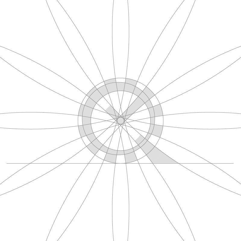
Precision engineering demands a precise visual construction. To transform the initial conceptual sketches into a balanced, professional mark, I developed a strict geometric grid using intersecting vector paths, concentric circles, and radial guides. This construction phase defines the exact proportions, curve radiuses, and spatial relationships between the gear teeth, the central letter mark, and the internal check mark. The overlay grid demonstrates how the structural weight of the "Q" aligns seamlessly with the mechanical profile of the cog. By using mathematically aligned angles and repeating radial divisions, the resulting shape maintains visual harmony and stability at any scale. Every line, arc, and cutout serves a functional purpose, bridging the artistic vision with rigorous digital design standards.
gmsf003
gmsf04
final lockup
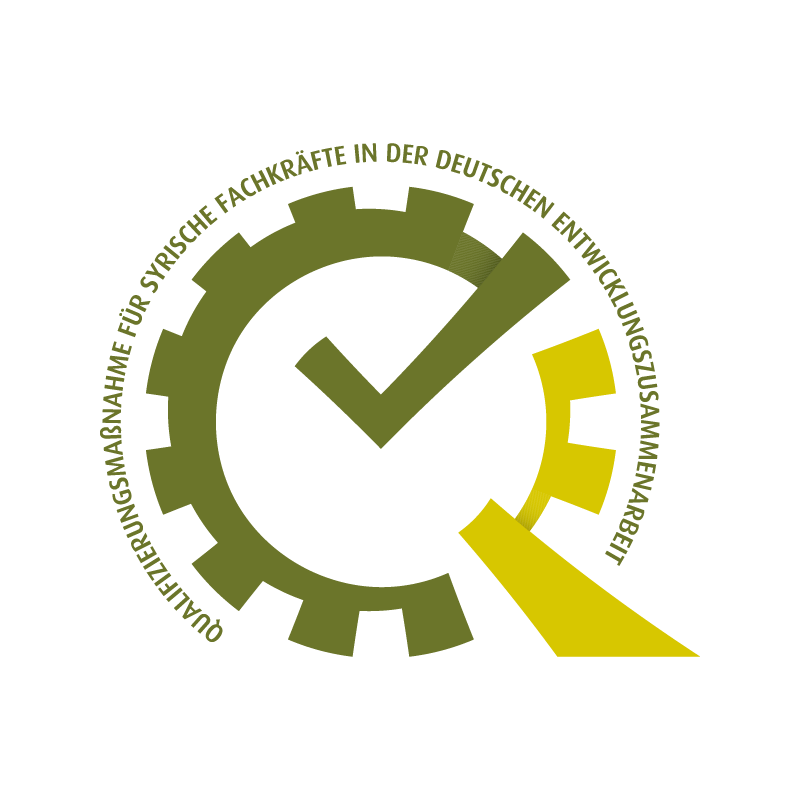
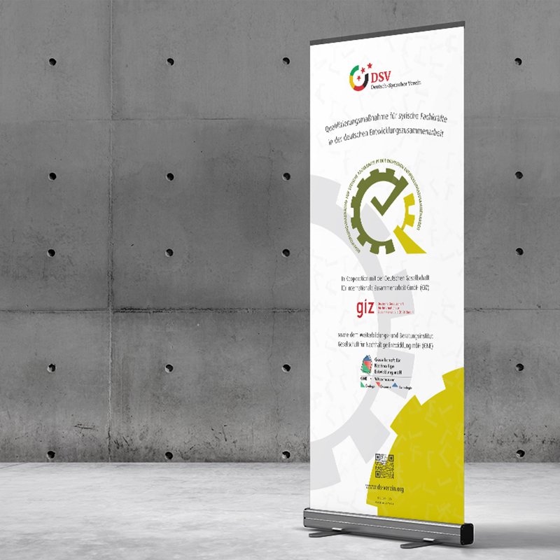
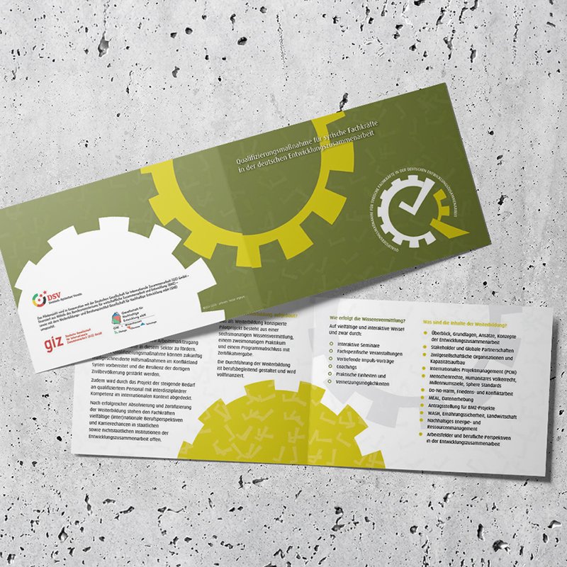
The complete brand lockup combines the symbolic mark with circular typography to form a cohesive, authoritative seal. The integrated emblem seamlessly merges the cog, the initial "Q," and the central check mark into a unified icon. Curving around the upper border is the official German program title: Qualifizierungsmaßnahme für syrische Fachkräfte in der deutschen Entwicklungszusammenarbeit. Framing the mark with clean, arc-aligned typography reinforces the official, institutional character of the program while keeping the focal point on the central symbol. The dynamic contrast between the main body and the lower accent tail gives the logo momentum and modern clarity. This final composition balances professional credibility, technical precision, and clear brand recognition across digital and print media.
color concept
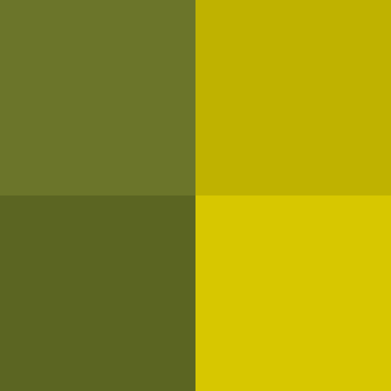
Color selection plays a strategic role in visual storytelling, especially for cross-cultural initiatives. Instead of using red, white, or black—colors shared by both the German and Syrian flags—this palette intentionally focuses on non-overlapping, distinct hues to represent a fresh, neutral space of collaboration. Green symbolizes growth, renewal, professional development, and new beginnings, while gold represents quality, success, and high standards of achievement. By carefully adjusting the saturation, depth, and subtle gradients of these two distinct tones, the palette achieves a modern, sophisticated aesthetic. This thoughtful color strategy avoids political visual clichés, focusing entirely on the positive trajectory of the professionals and the high-caliber standard of German development cooperation.

gmsf05

QMSF

2023
Darmstadt, Germany
inspiration
Every strong visual identity begins with a core metaphor. For this project, the conceptual foundation emerged directly from the mission of the Qualification Program for Syrian Professionals in German Development Cooperation. The central motif is the gearwheel—a timeless symbol of industry, collaboration, technical mastery, and structural progress. Syrian professionals bring valuable expertise, drive, and technical skills into a new environment; like a precise mechanism, their contributions power larger systems of development and cooperation. By grounding the visual concept in intricate machinery, the design honors the operational excellence and hard work of the participants. The industrial machinery drawing represents the starting point: translating human skill, engineering, and active participation into a unified symbolic framework that bridges background experience with future professional integration.
qmsf01
sketch breakdown
Translating a complex initiative into a clean visual mark requires deconstructing the message into distinct, meaningful iconography. This step breaks down the three foundational components that form the visual identity. First, the capital letter "Q" represents the program's primary title—Qualification—serving as the structural anchor. Second, the gearwheel symbolizes the target audience: skilled Syrian professionals who drive development and technical progress forward. Third, a clean check mark represents achievement, successful qualification, and verified competence. By sketching these elements side by side, the goal was to evaluate how three distinct concepts—identity, industry, and success—could merge without losing clarity. This stage bridges abstract ideas and geometric construction, laying the groundwork for a unified symbol.
qmsf02
geometric alignment
Precision engineering demands a precise visual construction. To transform the initial conceptual sketches into a balanced, professional mark, I developed a strict geometric grid using intersecting vector paths, concentric circles, and radial guides. This construction phase defines the exact proportions, curve radiuses, and spatial relationships between the gear teeth, the central letter mark, and the internal check mark. The overlay grid demonstrates how the structural weight of the "Q" aligns seamlessly with the mechanical profile of the cog. By using mathematically aligned angles and repeating radial divisions, the resulting shape maintains visual harmony and stability at any scale. Every line, arc, and cutout serves a functional purpose, bridging the artistic vision with rigorous digital design standards.
gmsf003
final lockup
The complete brand lockup combines the symbolic mark with circular typography to form a cohesive, authoritative seal. The integrated emblem seamlessly merges the cog, the initial "Q," and the central check mark into a unified icon. Curving around the upper border is the official German program title: Qualifizierungsmaßnahme für syrische Fachkräfte in der deutschen Entwicklungszusammenarbeit. Framing the mark with clean, arc-aligned typography reinforces the official, institutional character of the program while keeping the focal point on the central symbol. The dynamic contrast between the main body and the lower accent tail gives the logo momentum and modern clarity. This final composition balances professional credibility, technical precision, and clear brand recognition across digital and print media.
gmsf04
color concept
Color selection plays a strategic role in visual storytelling, especially for cross-cultural initiatives. Instead of using red, white, or black—colors shared by both the German and Syrian flags—this palette intentionally focuses on non-overlapping, distinct hues to represent a fresh, neutral space of collaboration. Green symbolizes growth, renewal, professional development, and new beginnings, while gold represents quality, success, and high standards of achievement. By carefully adjusting the saturation, depth, and subtle gradients of these two distinct tones, the palette achieves a modern, sophisticated aesthetic. This thoughtful color strategy avoids political visual clichés, focusing entirely on the positive trajectory of the professionals and the high-caliber standard of German development cooperation.

gmsf05

more insights about QMSF

more insights about QMSF