Mastabé

2023
an-Nabk, Syria
project identity & naming
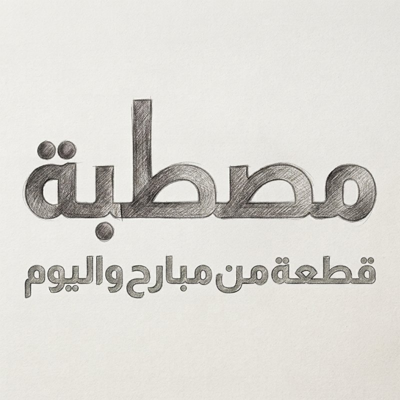
Mastabé is a cultural and heritage initiative created under the MAUJ Foundation, located in the historical region of An-Nabk near Damascus. Involved from the very beginning, I helped develop both the naming and strategic vision for the identity. The word Mastabé refers to the traditional raised terrace found in front of home entrances across An-Nabk. Historically, this space serves as the heart of social life, welcoming guests, housing vibrant family gatherings, and hosting community activities. It acts as an open-air bridge connecting past memories with present lives. This deep connection inspired the official tagline, "a piece of yesterday and today," grounding the brand in shared history, hospitality, and enduring cultural pride.

mt01
mt02
inspiration & visual concept
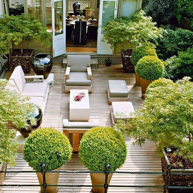
The visual foundation draws directly from the physical atmosphere of the traditional Syrian terrace. Among its most enduring features are potted plants and lush greenery, which sit on the Mastabé as permanent symbols of life, care, and hospitality. This plant motif was selected to represent living heritage—a continuous thread of life that thrives through changing times and passes naturally across generations. By focusing on organic growth within an architectural setting, the concept transforms a familiar domestic scene into a meaningful brand symbol. The plant element communicates vitality, resilience, and community roots, ensuring the initiative reflects both historical preservation and a flourishing cultural future.
geometric grid & cutout process
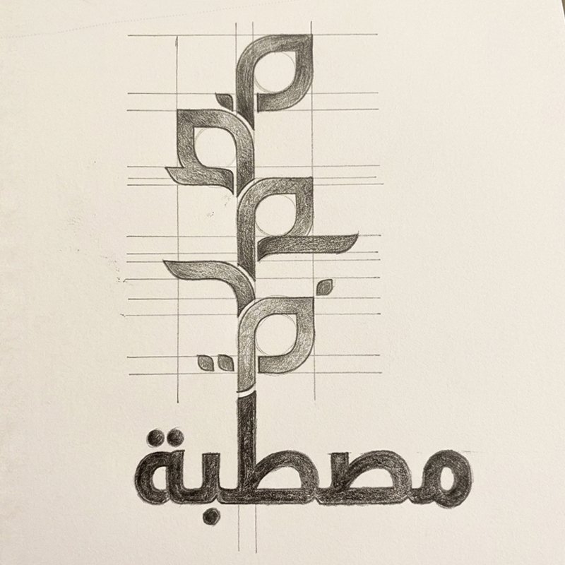
To translate the organic plant motif into a clean, modern mark, the design process relied on structured geometric cutouts. Using a precise grid system, overlapping curves and sharp angles were constructed to map out stylized leaves and architectural terrace planes. The natural form of the plant was simplified into pure mathematical vectors, striking a balance between heritage craftsmanship and contemporary visual clarity. Horizontal and vertical alignment lines refine the silhouette, integrating Arabic typographic elements directly into the growing stem. This geometric reduction ensures the logo remains highly adaptable, legible across all scales, and structurally grounded, bridging traditional regional imagery with timeless minimalist design.
mt03
mt04
final brand lockup
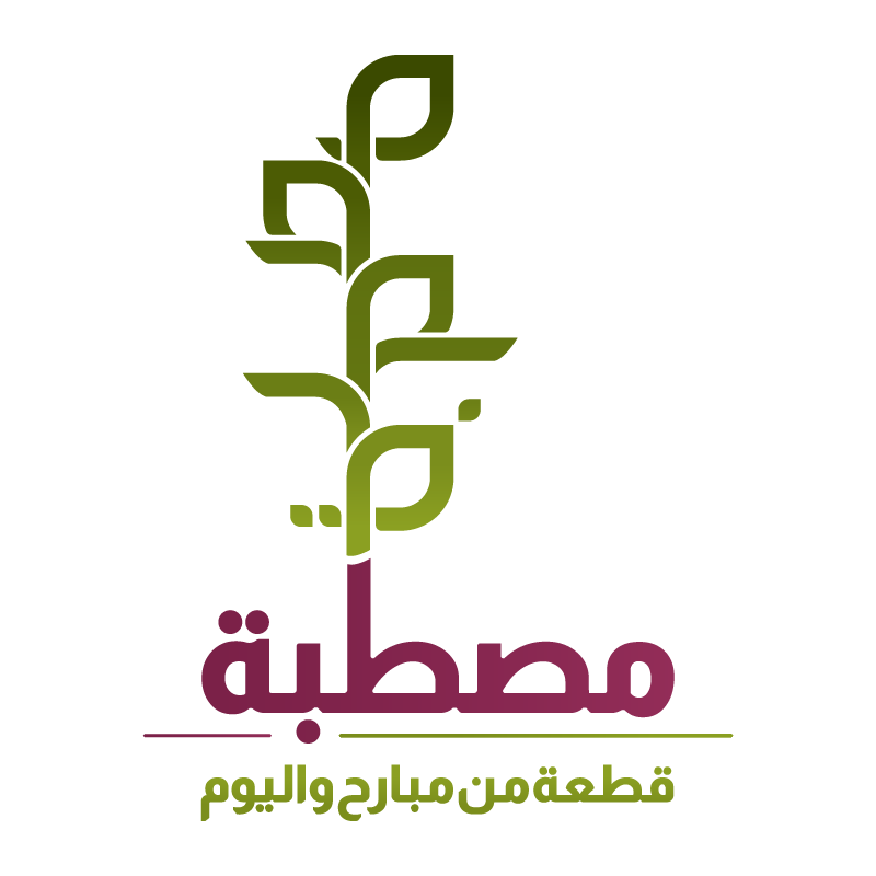
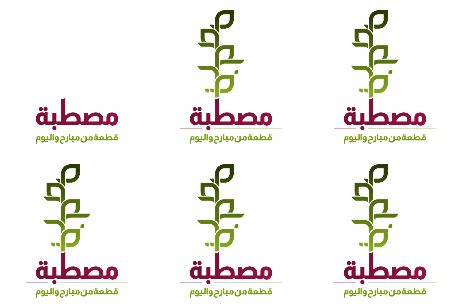
The completed logo lockup seamlessly integrates the geometric plant emblem with bold custom typography. The vertical stem extends upward directly from the central Arabic lettering of Mastabé, uniting the icon and logotype into a single cohesive structure. Beneath the primary brand name, the tagline "قطعة من مبارح واليوم" (a piece of yesterday and today) anchors the composition with secondary contrast. The overall arrangement establishes visual stability and vertical balance, ensuring the mark functions as a striking identity across digital media, print collateral, and cultural exhibition displays, communicating both historical depth and contemporary presence.
color palette
The color palette derives its richness directly from the natural landscape and cultural craft of An-Nabk. Deep olive and leafy green shades form the plant motif, reinforcing themes of nature, growth, and living tradition. In contrast, the primary brand lettering uses a rich, earthy purple-magenta. This distinctive shade draws inspiration from the region's historic textiles, artisan weaving, and traditional handmade carpets, where deep berry tones are widely cherished. By pairing organic greens with a culturally rooted purple, the palette achieves a vibrant balance that feels authentically Syrian, combining natural vitality with artisanal warmth.
mt05
mt06
motion & logo animation
To bring the brand identity to life in digital environments, the logo design incorporates a fluid motion system. The animation sequence begins with the grounded typography of the name, from which the central stem gently emerges and extends upward. Leaf by leaf, the geometric cutout shapes unfurl in synchronized succession, mimicking the natural pace of plant growth. This animated sequence visually reinforces the brand's core concept of continuous evolution, flourishing heritage, and living history. The dynamic motion adds an engaging narrative layer for video intros, social media assets, and interactive web headers.

Mastabé

2023
an-Nabk, Syria
project identity & naming
Mastabé is a cultural and heritage initiative created under the MAUJ Foundation, located in the historical region of An-Nabk near Damascus. Involved from the very beginning, I helped develop both the naming and strategic vision for the identity. The word Mastabé refers to the traditional raised terrace found in front of home entrances across An-Nabk. Historically, this space serves as the heart of social life, welcoming guests, housing vibrant family gatherings, and hosting community activities. It acts as an open-air bridge connecting past memories with present lives. This deep connection inspired the official tagline, "a piece of yesterday and today," grounding the brand in shared history, hospitality, and enduring cultural pride.

mt01
inspiration & visual concept
The visual foundation draws directly from the physical atmosphere of the traditional Syrian terrace. Among its most enduring features are potted plants and lush greenery, which sit on the Mastabé as permanent symbols of life, care, and hospitality. This plant motif was selected to represent living heritage—a continuous thread of life that thrives through changing times and passes naturally across generations. By focusing on organic growth within an architectural setting, the concept transforms a familiar domestic scene into a meaningful brand symbol. The plant element communicates vitality, resilience, and community roots, ensuring the initiative reflects both historical preservation and a flourishing cultural future.
mt02
geometric grid & cutout process
To translate the organic plant motif into a clean, modern mark, the design process relied on structured geometric cutouts. Using a precise grid system, overlapping curves and sharp angles were constructed to map out stylized leaves and architectural terrace planes. The natural form of the plant was simplified into pure mathematical vectors, striking a balance between heritage craftsmanship and contemporary visual clarity. Horizontal and vertical alignment lines refine the silhouette, integrating Arabic typographic elements directly into the growing stem. This geometric reduction ensures the logo remains highly adaptable, legible across all scales, and structurally grounded, bridging traditional regional imagery with timeless minimalist design.
mt03
final brand lockup
The completed logo lockup seamlessly integrates the geometric plant emblem with bold custom typography. The vertical stem extends upward directly from the central Arabic lettering of Mastabé, uniting the icon and logotype into a single cohesive structure. Beneath the primary brand name, the tagline "قطعة من مبارح واليوم" (a piece of yesterday and today) anchors the composition with secondary contrast. The overall arrangement establishes visual stability and vertical balance, ensuring the mark functions as a striking identity across digital media, print collateral, and cultural exhibition displays, communicating both historical depth and contemporary presence.
mt04
color palette
The color palette derives its richness directly from the natural landscape and cultural craft of An-Nabk. Deep olive and leafy green shades form the plant motif, reinforcing themes of nature, growth, and living tradition. In contrast, the primary brand lettering uses a rich, earthy purple-magenta. This distinctive shade draws inspiration from the region's historic textiles, artisan weaving, and traditional handmade carpets, where deep berry tones are widely cherished. By pairing organic greens with a culturally rooted purple, the palette achieves a vibrant balance that feels authentically Syrian, combining natural vitality with artisanal warmth.
mt05
motion & logo animation
To bring the brand identity to life in digital environments, the logo design incorporates a fluid motion system. The animation sequence begins with the grounded typography of the name, from which the central stem gently emerges and extends upward. Leaf by leaf, the geometric cutout shapes unfurl in synchronized succession, mimicking the natural pace of plant growth. This animated sequence visually reinforces the brand's core concept of continuous evolution, flourishing heritage, and living history. The dynamic motion adds an engaging narrative layer for video intros, social media assets, and interactive web headers.
mt06