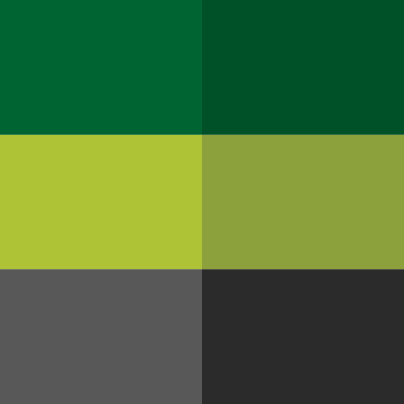
The color palette was chosen to convey institutional trust, stability, and ongoing prosperity. Dark charcoal gray grounds the composition, offering strong contrast, modern clarity, and formal balance. Deep emerald green and vibrant olive green bring life to the icon, symbolizing growth, renewal, health, and sustainable development. Gray evokes organizational reliability and professional authority, while the contrasting green shades add energy and optimism. This organic color pairing reflects the collaborative nature of the organization, representing a harmonious relationship between tradition and progress. The resulting scheme is versatile and visually striking, providing a welcoming yet sophisticated aesthetic for all brand applications across online and print platforms.