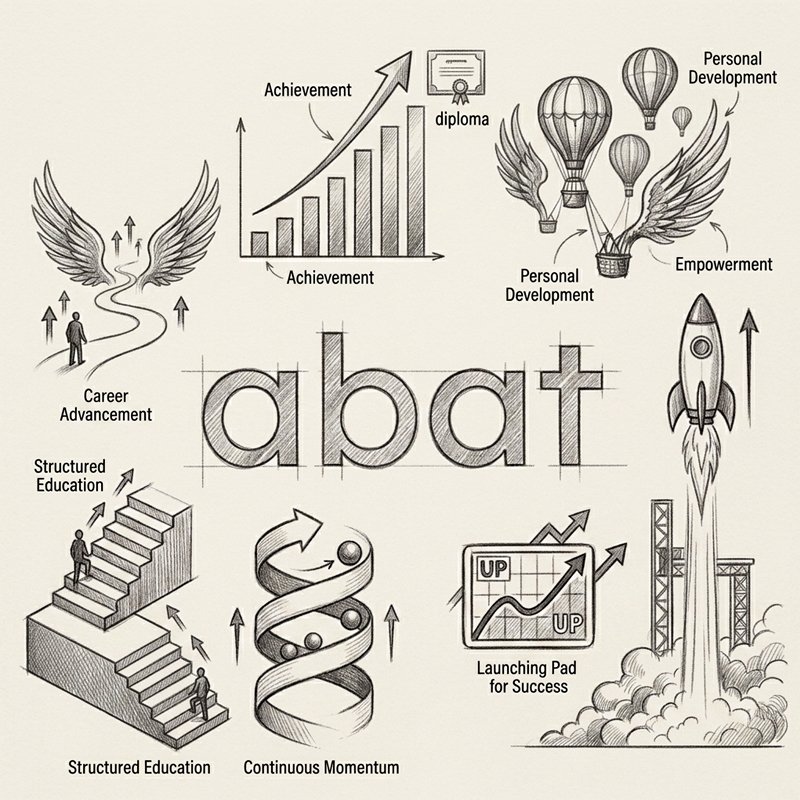
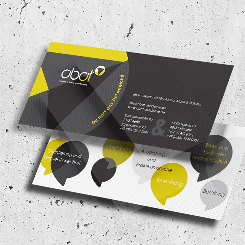
The sketching phase explored various visual metaphors representing progress, ascension, and transformation. Initial studies tested diverse concepts including rockets taking off, soaring hot air balloons, upward-climbing staircases, growth charts, and ascending spirals. While these literal illustrations communicated the theme of "going up," the goal was to avoid visual clutter and distill the idea into its simplest, most memorable geometric form. Through continuous sketching around the central wordmark abat, the process focused on integrating upward motion directly into the typography itself, laying the groundwork for a sleek, modern emblem that remains clean, recognizable, and versatile across applications.