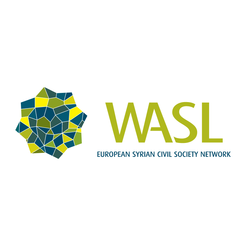
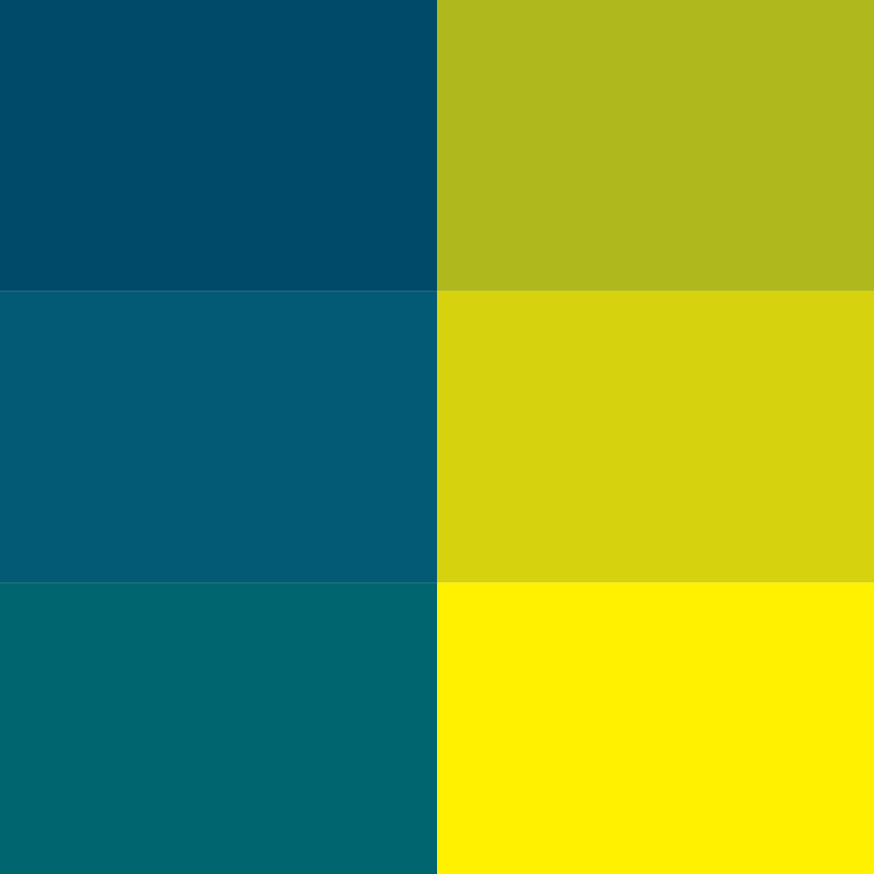
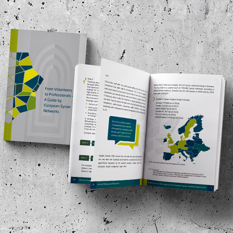
The color strategy draws direct inspiration from official European symbolism, adapting classic blue and yellow tones to reflect the network's European operational context. To establish a modern identity, the palette refines standard primary colors into a sophisticated spectrum of deep teal, rich navy, olive green, and vibrant yellow. The contrasting cool and warm shades emphasize the individual mosaic tiles within the logo mark, ensuring the geometric pattern remains distinct and readable. By blending European visual cues with warm accent tones, the color scheme visually represents the dialogue between Syrian community roots and European integration, establishing a cohesive look across all digital and print materials.