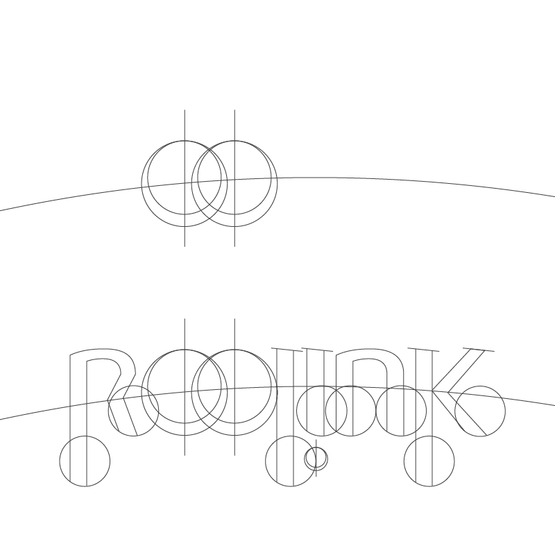
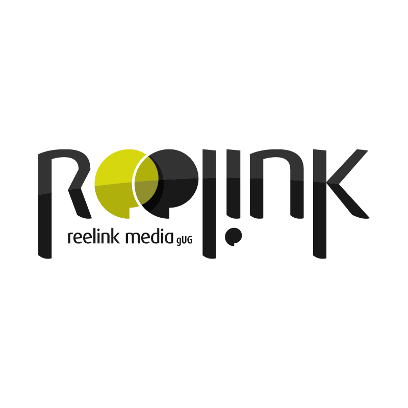
Translating the icon into a unified wordmark required strict typographic grid alignment. Utilizing structural curves derived from the baseline FF Dax geometry, the letterforms were customized to match the unique curvature of the centerpiece emblem.
Curved alignment guides ensured the top arcs of the **"r"**, **"e"**, **"l"**, **"i"**, **"n"**, and **"k"** followed a continuous macro-radius across the horizontal span. This bespoke construction treats the entire wordmark as an integrated logotype, where every character shares the geometric DNA of the central "ee" icon.