Mittani

2023
Berlin, Germany
historical inspiration & geographic identity
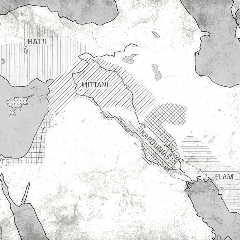
Mittani is a civil society organization dedicated to preserving and sharing Kurdish culture. The brand name draws directly from the ancient Mittani kingdom, which once spanned historical territories across modern-day Syria, Iraq, Turkey, and Iran. The primary creative challenge was avoiding ubiquitous cultural clichés—specifically steering clear of standard Kurdish flag colors and the sun symbol. Instead, inspiration was drawn from the region’s ancient geographic title: *Naharain*, meaning "the land of two rivers" (Mesopotamia).

mittani01
mittani02
core visual element
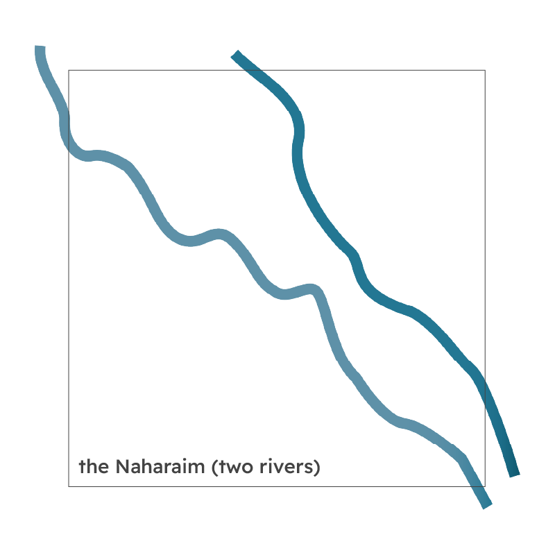
The identity centers on the foundational narrative of the two rivers—the Tigris and the Euphrates—which defined the fertile geography of ancient Mittani. By taking the winding pathways of these dual waterways and distilling them into minimalist, parallel organic lines, the visual language establishes a direct bridge between historical heritage and contemporary design.
logo architecture & integration
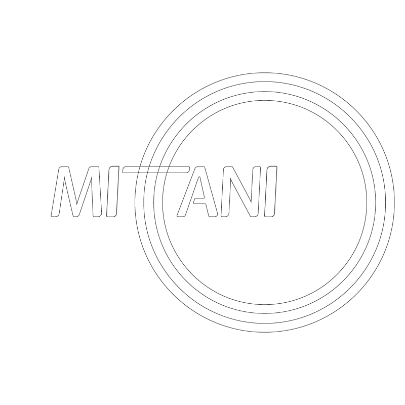
The design seamlessly integrates the river motif into the custom logotype. The double "T" in the word **Mittani** was selected as the natural anchor point for the mark. By replacing the standard vertical stems of the letters "T" with sweeping, curved river channels, the typography organically incorporates the geography of *Naharain* without sacrificing legibility or simplicity.
mittani03
mittani04
final mark & brand lockup
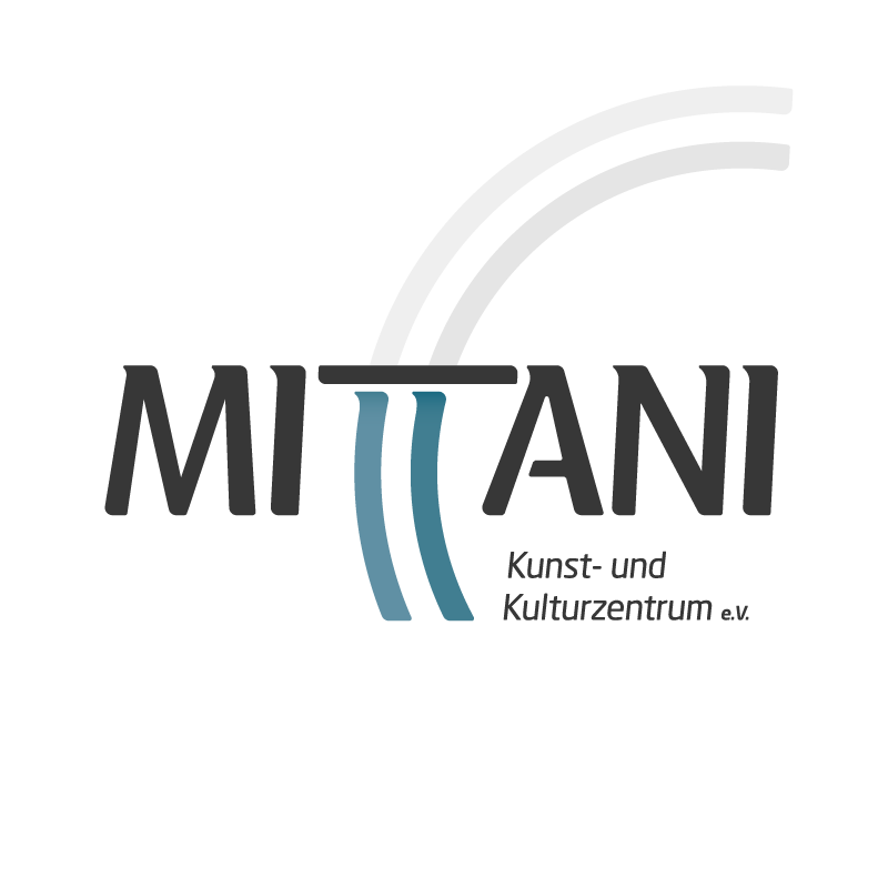
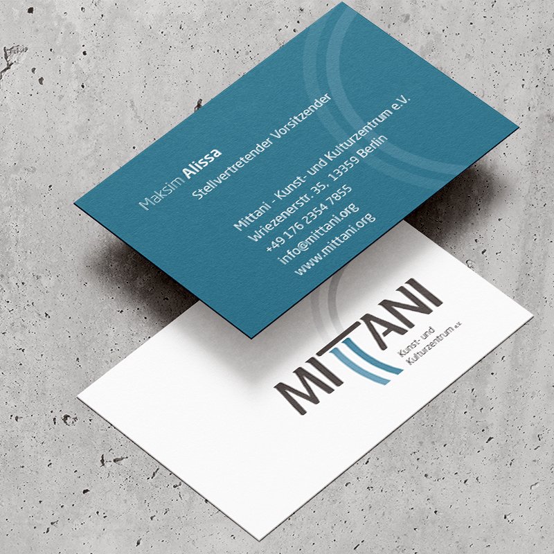
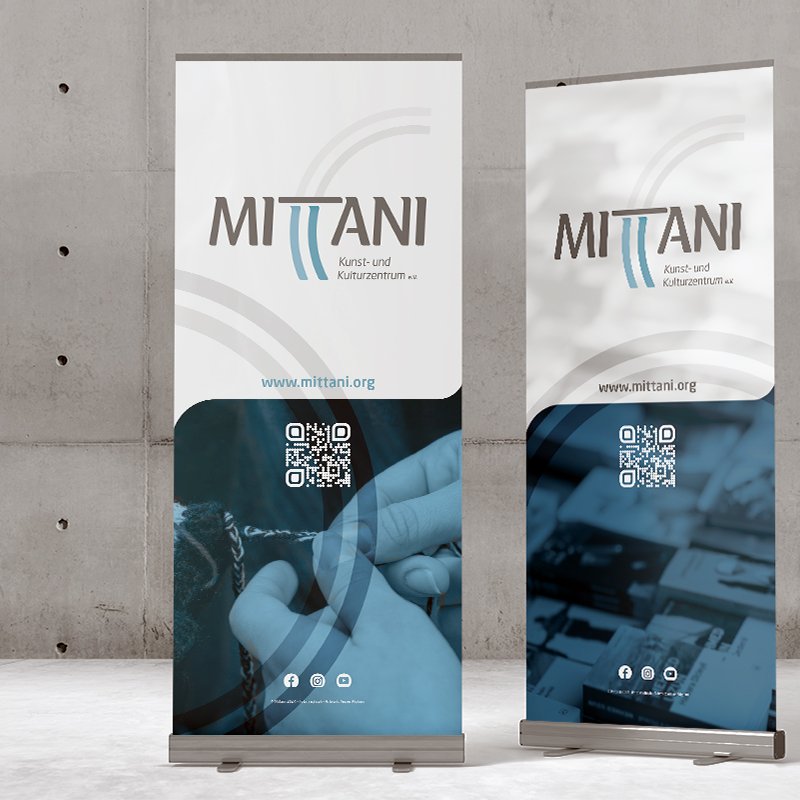
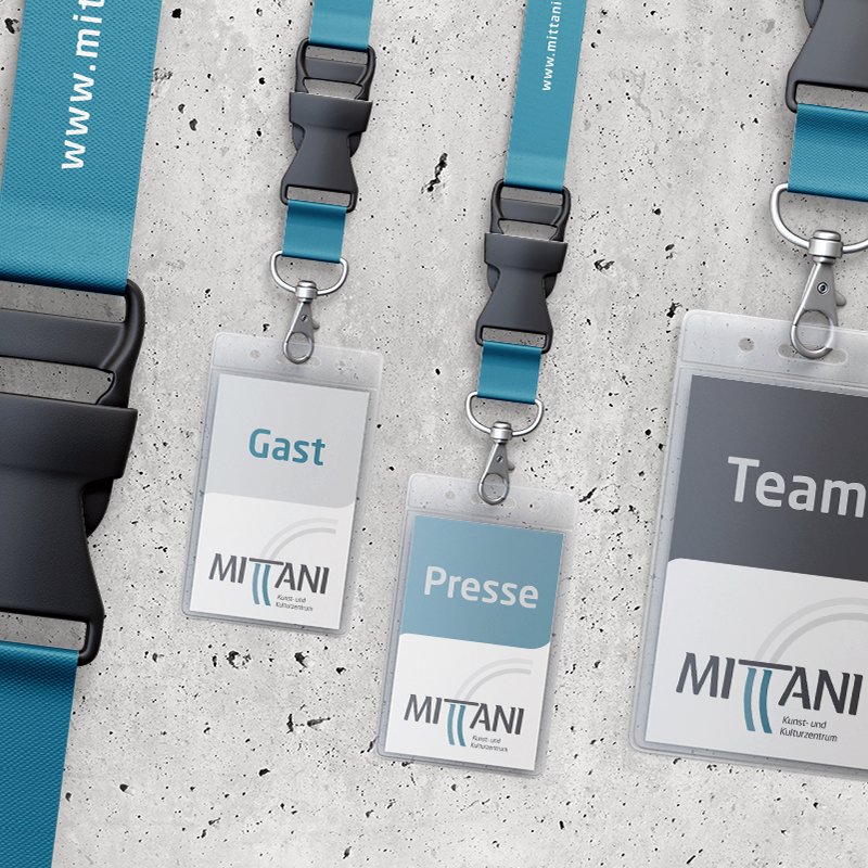
The completed identity showcases the transformed double "T" structure extending upward and echoing out in subtle, arching lines. The dark charcoal lettering anchors the mark, while the river channels flow through the center in muted blue, accompanied by the descriptive subtitle *Kunst- und Kulturzentrum e.V.* (Art and Cultural Center).
color palette
Departing from standard gepgraphical color palettes, the brand relies on a restrained palette rooted in water and history: Deep River Blue: Represents depth, historical continuity, and fluid cultural transmission. Muted Teal Blue: Adds modern sophistication and tonal balance. Charcoal Dark Grey: Delivers strong typographic contrast, structure, and clarity.
mittani05
mittani06
website & festival identity
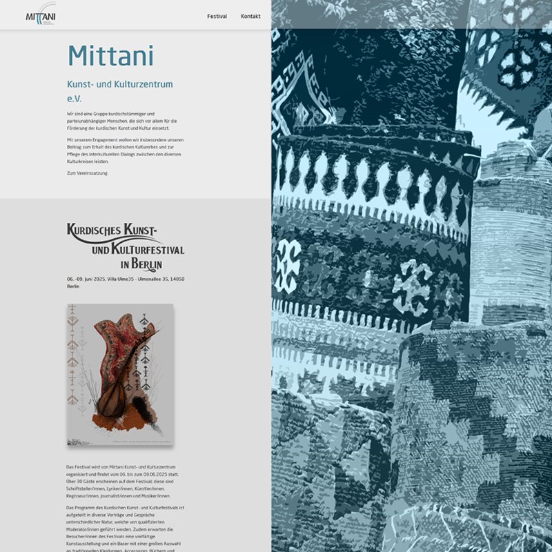
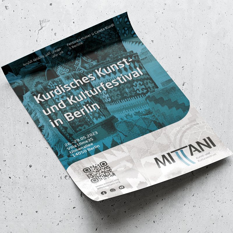
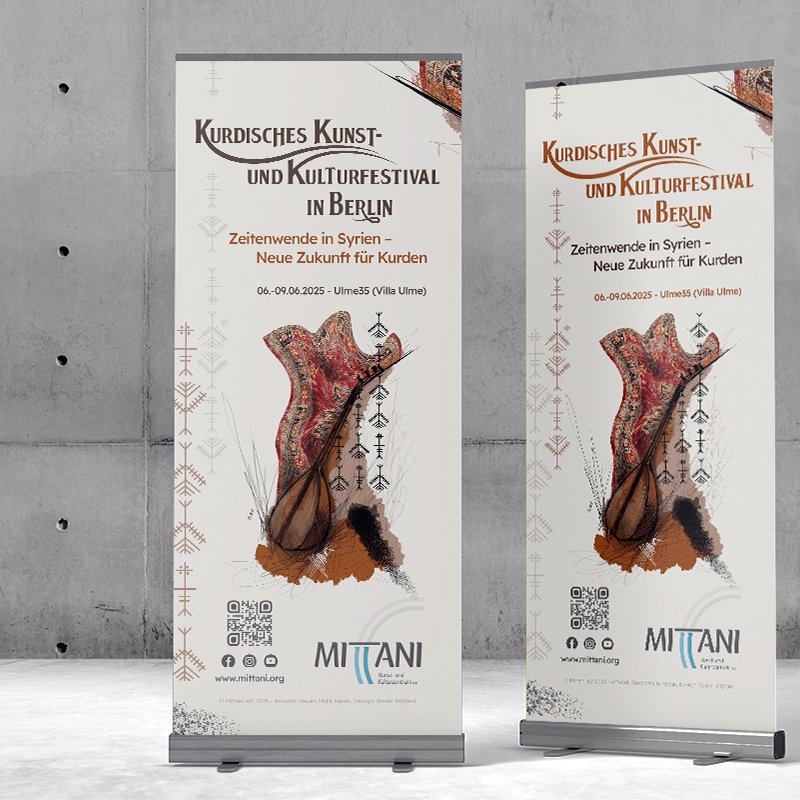
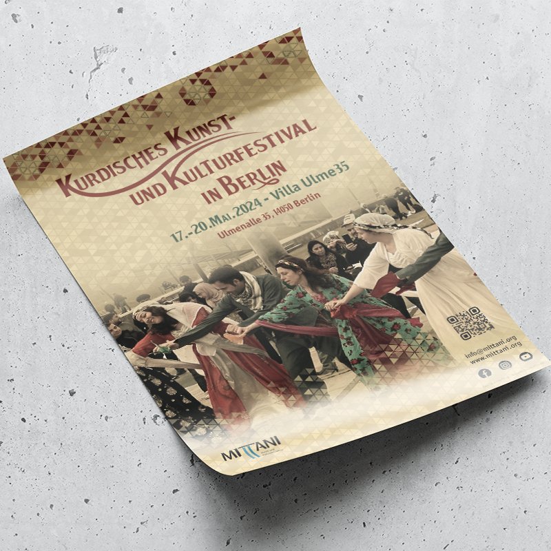
The digital platform presents a light skin with generous spacing to let cultural content breathe. A major focus of the interface is the annual *Kurdisches Kunst- und Kulturfestival in Berlin*, featuring dedicated event promotion, artistic highlights, and cultural programming alongside rich, duotone imagery reflecting historical Kurdish architecture and music.

Mittani

2023
Berlin, Germany
historical inspiration & geographic identity
Mittani is a civil society organization dedicated to preserving and sharing Kurdish culture. The brand name draws directly from the ancient Mittani kingdom, which once spanned historical territories across modern-day Syria, Iraq, Turkey, and Iran. The primary creative challenge was avoiding ubiquitous cultural clichés—specifically steering clear of standard Kurdish flag colors and the sun symbol. Instead, inspiration was drawn from the region’s ancient geographic title: *Naharain*, meaning "the land of two rivers" (Mesopotamia).

mittani01
core visual element
The identity centers on the foundational narrative of the two rivers—the Tigris and the Euphrates—which defined the fertile geography of ancient Mittani. By taking the winding pathways of these dual waterways and distilling them into minimalist, parallel organic lines, the visual language establishes a direct bridge between historical heritage and contemporary design.
mittani02
logo architecture & integration
The design seamlessly integrates the river motif into the custom logotype. The double "T" in the word **Mittani** was selected as the natural anchor point for the mark. By replacing the standard vertical stems of the letters "T" with sweeping, curved river channels, the typography organically incorporates the geography of *Naharain* without sacrificing legibility or simplicity.
mittani03
final mark & brand lockup
The completed identity showcases the transformed double "T" structure extending upward and echoing out in subtle, arching lines. The dark charcoal lettering anchors the mark, while the river channels flow through the center in muted blue, accompanied by the descriptive subtitle *Kunst- und Kulturzentrum e.V.* (Art and Cultural Center).
mittani04
color palette
Departing from standard gepgraphical color palettes, the brand relies on a restrained palette rooted in water and history: Deep River Blue: Represents depth, historical continuity, and fluid cultural transmission. Muted Teal Blue: Adds modern sophistication and tonal balance. Charcoal Dark Grey: Delivers strong typographic contrast, structure, and clarity.
mittani05
website & festival identity
The digital platform presents a light skin with generous spacing to let cultural content breathe. A major focus of the interface is the annual *Kurdisches Kunst- und Kulturfestival in Berlin*, featuring dedicated event promotion, artistic highlights, and cultural programming alongside rich, duotone imagery reflecting historical Kurdish architecture and music.
mittani06

more insights about Mittani

more insights about Mittani