MAUJ

2020
an-Nabk, Syria
Strategic Foundation & Philosophy
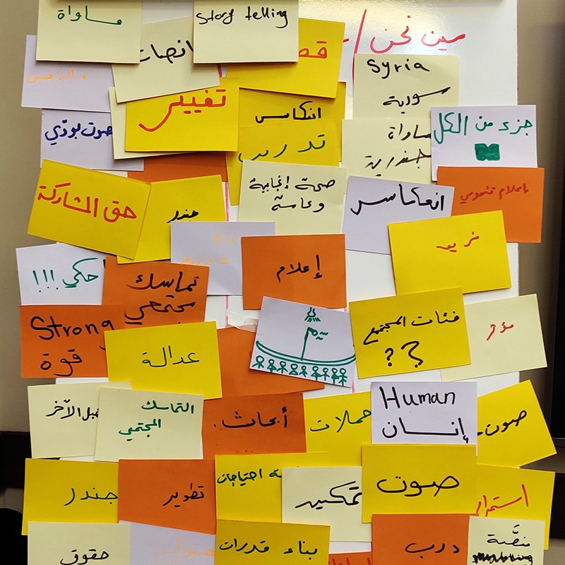
Rebranding an established civil society organization originally founded in 2014 required a delicate strategy: breaking free from legacy brand traps while honoring earned community trust. Initiated during strategic workshops in December 2019, the core transformation began by establishing the name "MAUJ" (مَوْج)—the Arabic word for "waves." The sticky-note strategy sessions mapped out essential organizational imperatives: societal change, inclusivity, human rights, research, and youth empowerment. The name "MAUJ" was chosen to embody dynamic motion—a symbolic wave of development pushing positive change across society.
mauj01
mauj02
visual concept & typographic synthesis
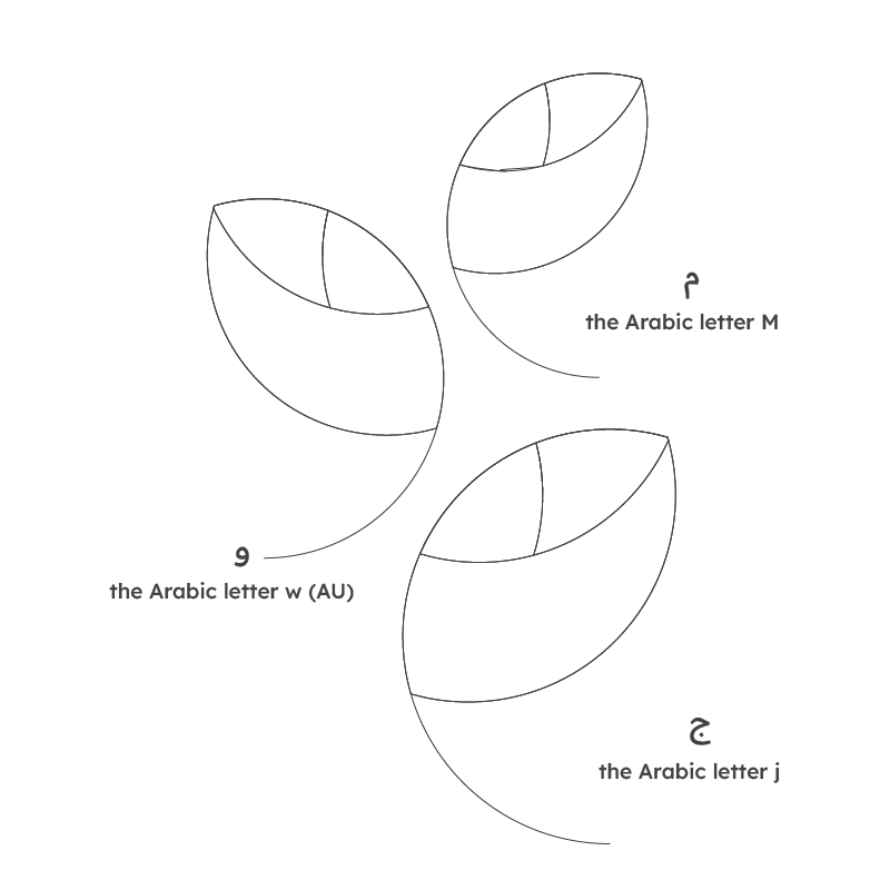
The visual concept fuses natural growth motifs with Arabic calligraphic structures. Botanical leaves were selected to represent growth, prosperity, and continuous societal renewal. To bridge visual symbol and brand name, the leaf structures were engineered directly around the letterforms of the Arabic word "MAUJ" (مَـوْج): Meem (م): Forms the upper leaf loop. Waw (و): Defines the central connecting leaf and stem curve. Jeem (ج): Extends into the lower leaf sweep and swooping baseline tail. This synthesis merges language and symbolism into a single unified typographic icon.
geometric precision & vector grid
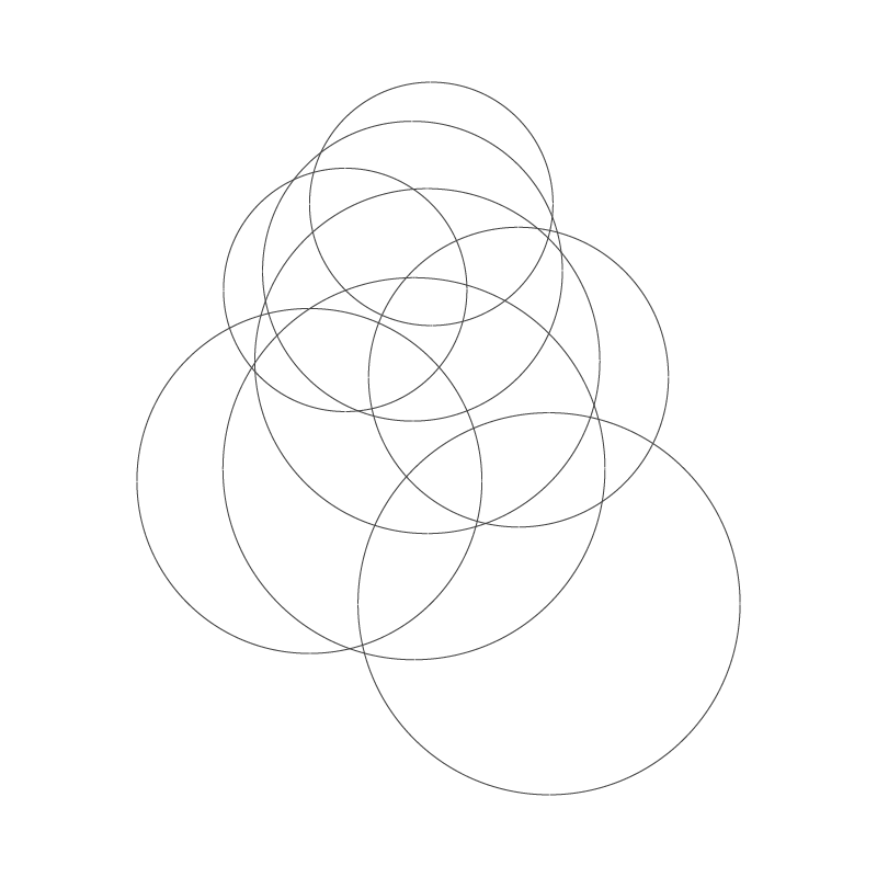
To execute the complex interlock of leaf forms and Arabic letterforms, the icon was constructed over a multi-circle geometric grid. By plotting overlapping circular arcs, the vector cutout process established precise mathematical curvature for every stroke and counter-space. This disciplined geometric framework balances the fluid nature of the wave motif with technical harmony, ensuring the complex emblem maintains crisp optical legibility across print, digital, and field applications.
mauj03
mauj04
final mark & bilingual lockup
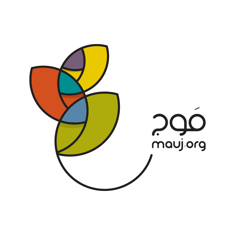
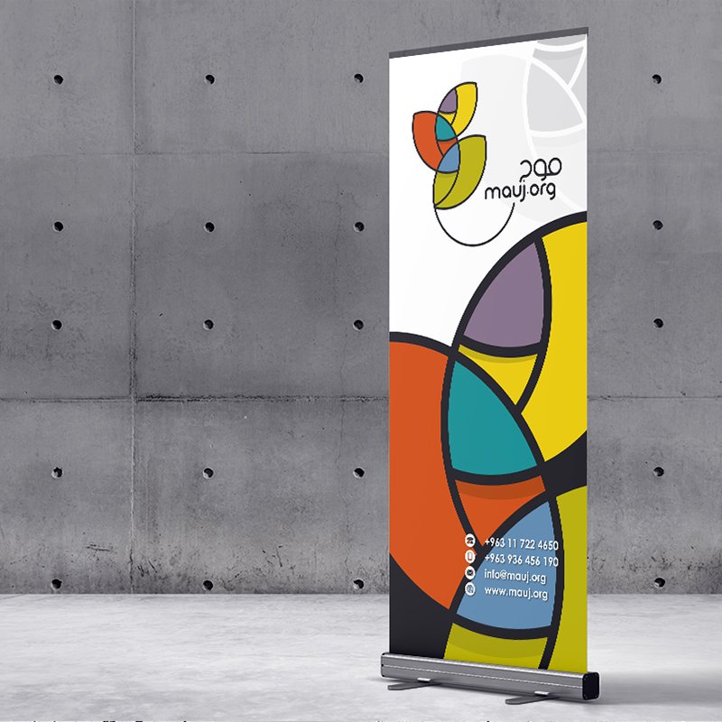
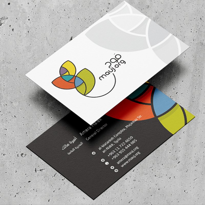
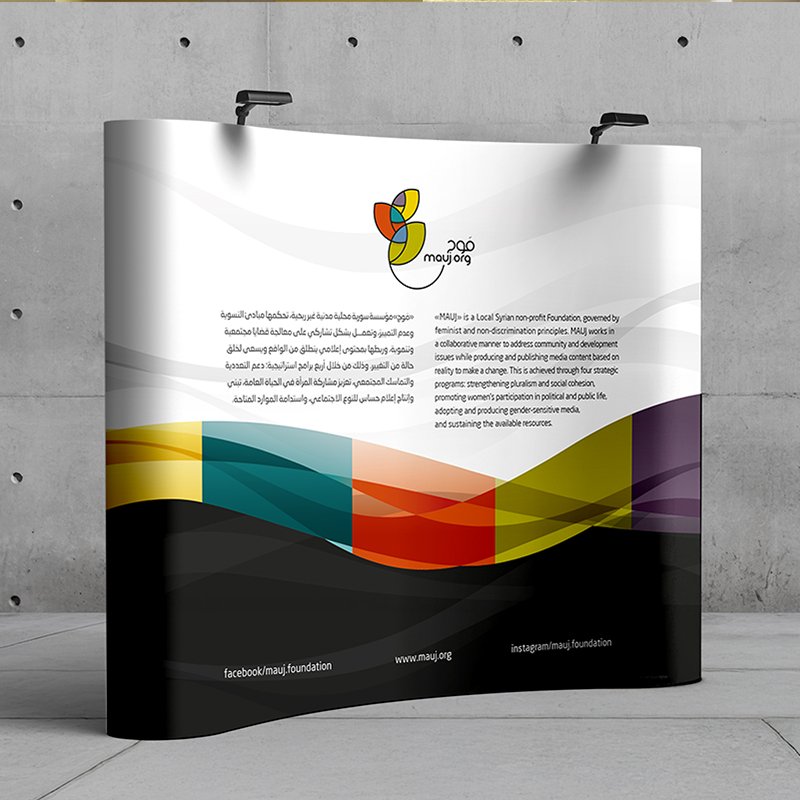
The finalized identity presents a vibrant, stained-glass visual effect. Distinct interior vector segments are defined by bold black outlines, creating an energetic motif that flows into a long, fluid tail anchoring the wordmark. The primary lockup incorporates a modern, custom Arabic logotype alongside the English URL domain (**mauj.org**). The fluid, sweeping baseline unifies the symbol and typography, representing continuous momentum and community outreach.
color palette & plurality
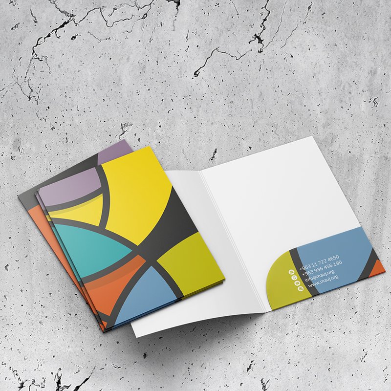
The color system uses a nine-tone matrix to visually celebrate societal diversity, inclusivity, and multi-faceted civil engagement. Warm Tones (Yellow, Ochre, Terracotta, Orange): Represent energy, human warmth, and community action. Cool Tones (Teal, Slate Blue, Deep Purple, Olive): Provide institutional balance, depth, research rigor, and stability. By utilizing segmented color fields within the leaf motif, the identity communicates plurality and unity within a single icon.

mauj05
mauj06
digital interface & interactive UX
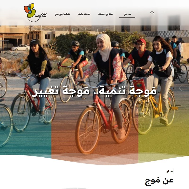
The web platform at mauj.org translates the brand's organic warmth into a modern, accessible interface. Designed with an open, high-legibility layout, the UI utilizes generous white space and clean Arabic typography to showcase field campaigns, media resources, and civic projects. Directly inspired by the brand philosophy, the homepage hero section features dynamic translucent wave overlays in brand colors. This subtle movement reinforces the narrative of MAUJ as a driving wave of societal development and social impact.

MAUJ

2020
an-Nabk, Syria
Strategic Foundation & Philosophy
Rebranding an established civil society organization originally founded in 2014 required a delicate strategy: breaking free from legacy brand traps while honoring earned community trust. Initiated during strategic workshops in December 2019, the core transformation began by establishing the name "MAUJ" (مَوْج)—the Arabic word for "waves." The sticky-note strategy sessions mapped out essential organizational imperatives: societal change, inclusivity, human rights, research, and youth empowerment. The name "MAUJ" was chosen to embody dynamic motion—a symbolic wave of development pushing positive change across society.
mauj01
visual concept & typographic synthesis
The visual concept fuses natural growth motifs with Arabic calligraphic structures. Botanical leaves were selected to represent growth, prosperity, and continuous societal renewal. To bridge visual symbol and brand name, the leaf structures were engineered directly around the letterforms of the Arabic word "MAUJ" (مَـوْج): Meem (م): Forms the upper leaf loop. Waw (و): Defines the central connecting leaf and stem curve. Jeem (ج): Extends into the lower leaf sweep and swooping baseline tail. This synthesis merges language and symbolism into a single unified typographic icon.
mauj02
geometric precision & vector grid
To execute the complex interlock of leaf forms and Arabic letterforms, the icon was constructed over a multi-circle geometric grid. By plotting overlapping circular arcs, the vector cutout process established precise mathematical curvature for every stroke and counter-space. This disciplined geometric framework balances the fluid nature of the wave motif with technical harmony, ensuring the complex emblem maintains crisp optical legibility across print, digital, and field applications.
mauj03
final mark & bilingual lockup
The finalized identity presents a vibrant, stained-glass visual effect. Distinct interior vector segments are defined by bold black outlines, creating an energetic motif that flows into a long, fluid tail anchoring the wordmark. The primary lockup incorporates a modern, custom Arabic logotype alongside the English URL domain (**mauj.org**). The fluid, sweeping baseline unifies the symbol and typography, representing continuous momentum and community outreach.
mauj04
color palette & plurality
The color system uses a nine-tone matrix to visually celebrate societal diversity, inclusivity, and multi-faceted civil engagement. Warm Tones (Yellow, Ochre, Terracotta, Orange): Represent energy, human warmth, and community action. Cool Tones (Teal, Slate Blue, Deep Purple, Olive): Provide institutional balance, depth, research rigor, and stability. By utilizing segmented color fields within the leaf motif, the identity communicates plurality and unity within a single icon.

mauj05
digital interface & interactive UX
The web platform at mauj.org translates the brand's organic warmth into a modern, accessible interface. Designed with an open, high-legibility layout, the UI utilizes generous white space and clean Arabic typography to showcase field campaigns, media resources, and civic projects. Directly inspired by the brand philosophy, the homepage hero section features dynamic translucent wave overlays in brand colors. This subtle movement reinforces the narrative of MAUJ as a driving wave of societal development and social impact.
mauj06

more insights about MAUJ

more insights about MAUJ