Mashgal

2026
Damascus, Syria
the concepts
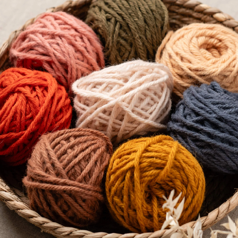
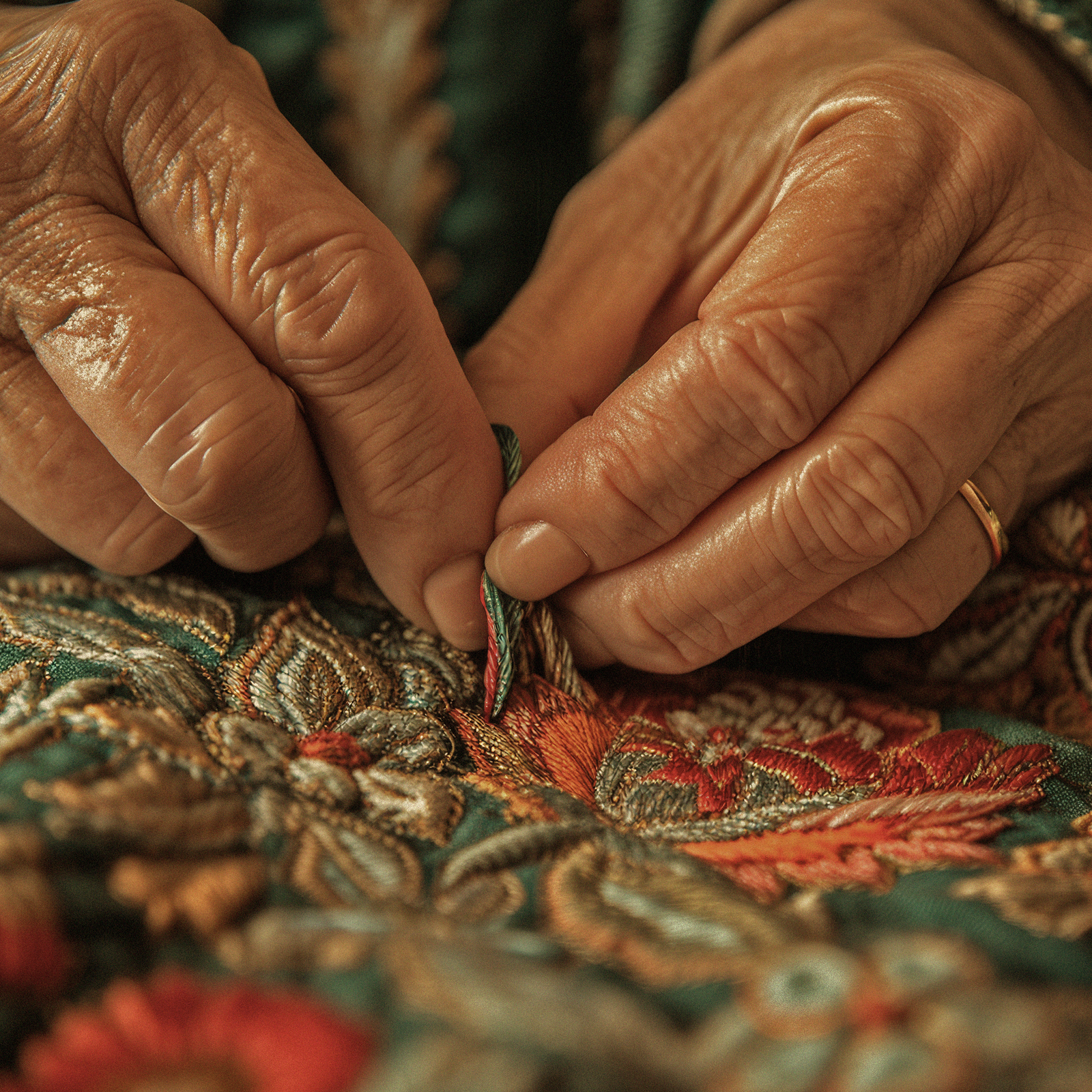
For this handicraft project based in Syria, I set out to capture the essence of regional heritage by focusing on three core elements: the warmth and grain of wood, the emotional weight of poetry, and the geometric elegance of Arabic calligraphy. While experimenting with different materials, the yarn’s distinct rounded shape immediately stood out to me. Its unique form seemed to mimic the rhythmic flow of handwritten scripts while bringing a soft, three-dimensional quality to the design. Guided by this initial spark, I built the entire project around this concept, allowing the yarn to interweave with structural details and transform traditional Syrian motifs into a tactile piece.
mashgal-inspiration
mashgal-sketch
the sketch
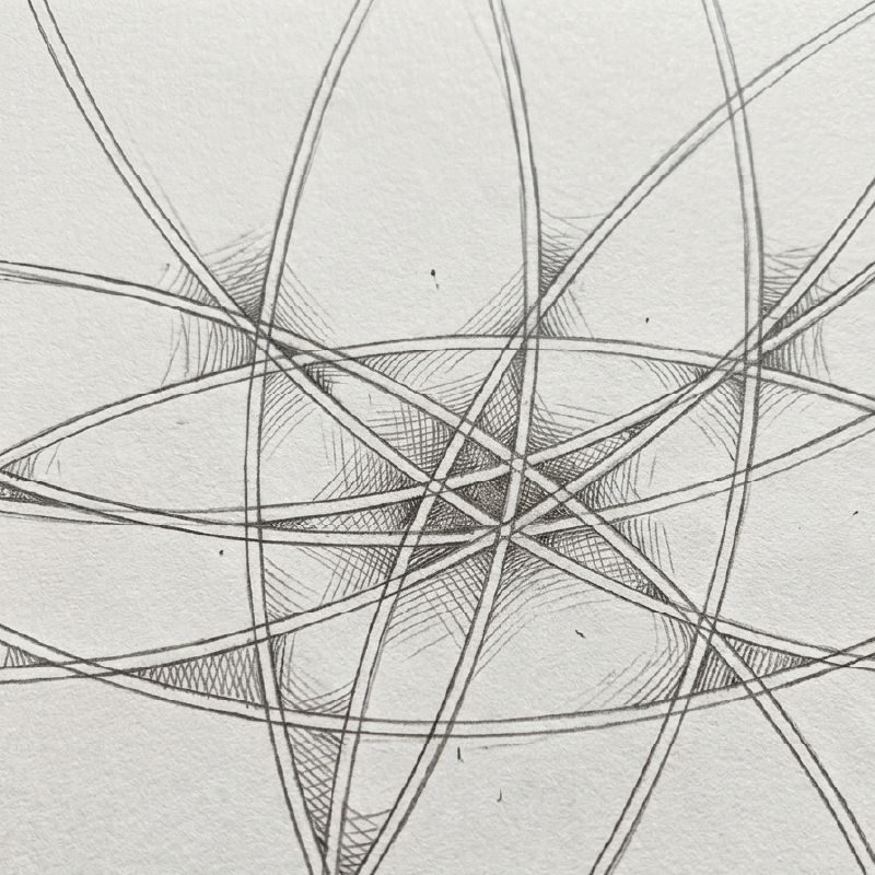
By this stage, it was clear that the project was heading toward a rounded logo mark. The true creative challenge, however, was finding a way to integrate the soft, fluid nature of the yarn into a single unified shape—all while avoiding the trap of a generic or cliché pictogram. The goal was to translate the physical medium into a sophisticated symbol that felt elevated rather than literal. I started sketching to explore how multiple colors could coexist within a single yarn ball. My focus was on finding a visual language that felt fluid and cohesive—allowing each color to have its own presence without disrupting the unity of the overall shape.
the abstraction
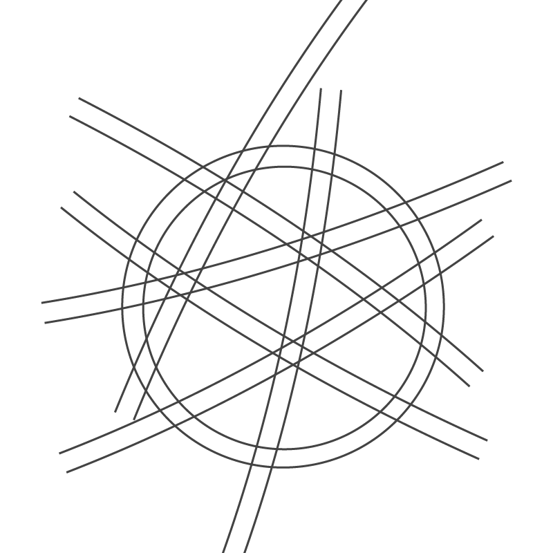
As I began to abstract and cutout the form, the concept became much more tangible. The yarn ball started taking on its distinct shapes and proportions—and that was the exact moment everything clicked. It was an unmistakable "eureka" moment where the design finally spoke for itself, confirming that this was the right direction.
mashgal03-cutout
mashgal-logo-v
the logo
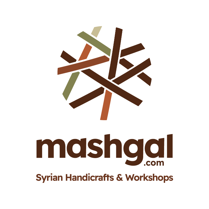
With those final details in place, the heart of the logo truly came to life—a minimalist, cutout pictogram that seamlessly translated the original concept into something that matched the client's vision. I then chose a gentle, rounded typeface to match the logo's organic character, fine-tuning its proportions and dimensions so the text and symbol felt like one unified mark. From the first napkin sketch to the polished final deliverable, the project took about 13 weeks of non-stop brainstorming, sketching, and structural design. It was a rigorous creative process, but standing back to look at the finished design made the entire effort deeply rewarding.
the color palette
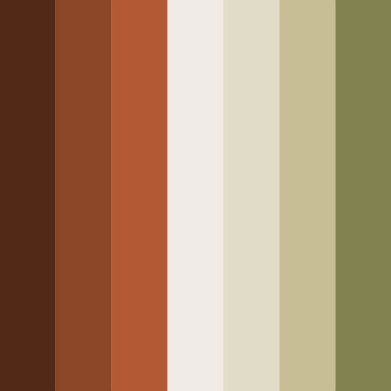
When it came to selecting the color palette, I had a relative degree of creative freedom and choosing the color palette was an open playground. The yarn itself could easily adapt to any shade, whether ocean blue, soft sage, or rich Coca-Cola red. Yet, to tell a complete story, I needed the colors to reflect the broader scope of Syrian handicrafts. I turned my focus toward natural, raw materials like terracotta. The final result features a warm, terracotta-inspired base grounded by a natural olive green accent color. This combination creates an organic, earthy atmosphere that highlights the tactile, handmade nature of the entire craft collection.

mashgal-colors
mashgal06-website
the website
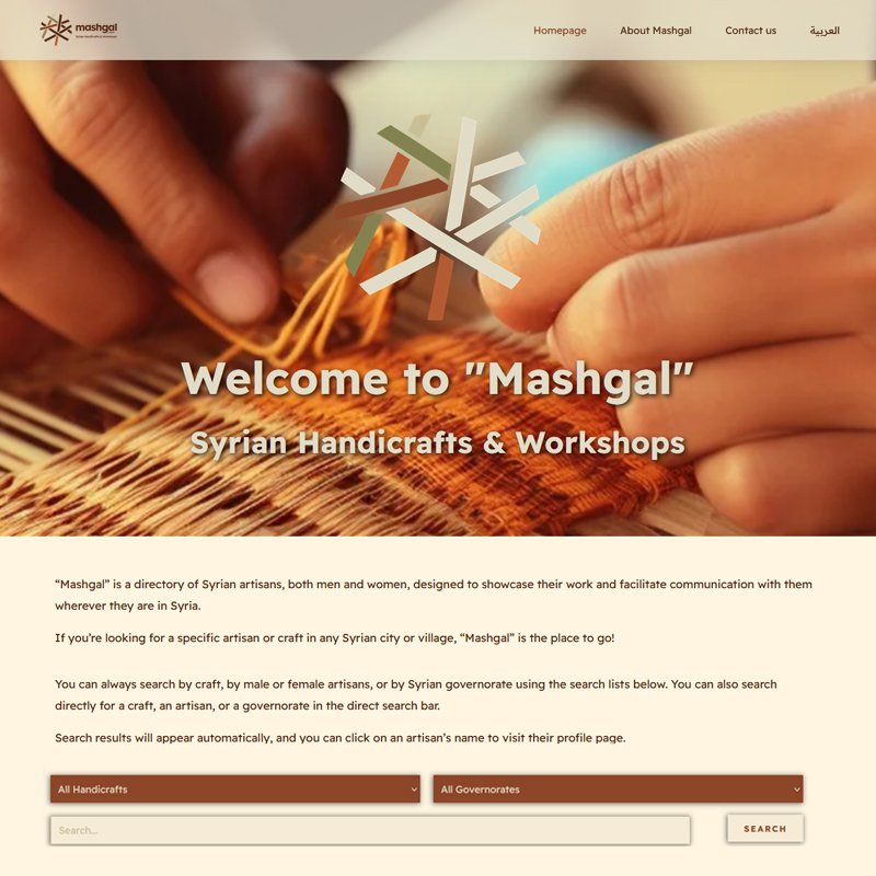
The second major component of the project was the development of a complete web directory showcasing Syrian artisans. To support this, I designed a backend database equipped with advanced search and filtering capabilities. Users can easily query artisans by location (governorate) and craft type, streamlining the process of locating specific craftsmen and craftswomen. Building upon the established visual identity, the frontend layout prioritizes clarity and effortless navigation, making the vast collection of artisan data easily accessible. This resulted in a fully responsive, bilingual digital experience designed for intuitive browsing across all devices.

Mashgal

2026
Damascus, Syria
the concepts
For this handicraft project based in Syria, I set out to capture the essence of regional heritage by focusing on three core elements: the warmth and grain of wood, the emotional weight of poetry, and the geometric elegance of Arabic calligraphy. While experimenting with different materials, the yarn’s distinct rounded shape immediately stood out to me. Its unique form seemed to mimic the rhythmic flow of handwritten scripts while bringing a soft, three-dimensional quality to the design. Guided by this initial spark, I built the entire project around this concept, allowing the yarn to interweave with structural details and transform traditional Syrian motifs into a tactile piece.
mashgal-inspiration
the sketch
By this stage, it was clear that the project was heading toward a rounded logo mark. The true creative challenge, however, was finding a way to integrate the soft, fluid nature of the yarn into a single unified shape—all while avoiding the trap of a generic or cliché pictogram. The goal was to translate the physical medium into a sophisticated symbol that felt elevated rather than literal. I started sketching to explore how multiple colors could coexist within a single yarn ball. My focus was on finding a visual language that felt fluid and cohesive—allowing each color to have its own presence without disrupting the unity of the overall shape.
mashgal-sketch
the abstraction
As I began to abstract and cutout the form, the concept became much more tangible. The yarn ball started taking on its distinct shapes and proportions—and that was the exact moment everything clicked. It was an unmistakable "eureka" moment where the design finally spoke for itself, confirming that this was the right direction.
mashgal03-cutout
the logo
With those final details in place, the heart of the logo truly came to life—a minimalist, cutout pictogram that seamlessly translated the original concept into something that matched the client's vision. I then chose a gentle, rounded typeface to match the logo's organic character, fine-tuning its proportions and dimensions so the text and symbol felt like one unified mark. From the first napkin sketch to the polished final deliverable, the project took about 13 weeks of non-stop brainstorming, sketching, and structural design. It was a rigorous creative process, but standing back to look at the finished design made the entire effort deeply rewarding.
mashgal-logo-v
the color palette
When it came to selecting the color palette, I had a relative degree of creative freedom and choosing the color palette was an open playground. The yarn itself could easily adapt to any shade, whether ocean blue, soft sage, or rich Coca-Cola red. Yet, to tell a complete story, I needed the colors to reflect the broader scope of Syrian handicrafts. I turned my focus toward natural, raw materials like terracotta. The final result features a warm, terracotta-inspired base grounded by a natural olive green accent color. This combination creates an organic, earthy atmosphere that highlights the tactile, handmade nature of the entire craft collection.

mashgal-colors
the website
The second major component of the project was the development of a complete web directory showcasing Syrian artisans. To support this, I designed a backend database equipped with advanced search and filtering capabilities. Users can easily query artisans by location (governorate) and craft type, streamlining the process of locating specific craftsmen and craftswomen. Building upon the established visual identity, the frontend layout prioritizes clarity and effortless navigation, making the vast collection of artisan data easily accessible. This resulted in a fully responsive, bilingual digital experience designed for intuitive browsing across all devices.
mashgal06-website

more insights about Mashgal

more insights about Mashgal