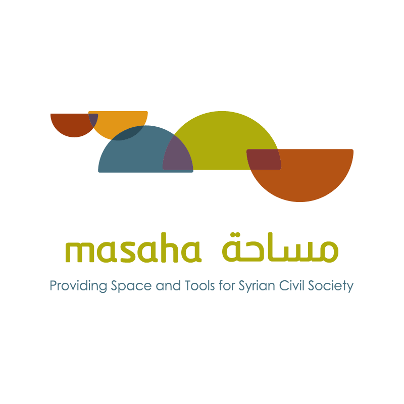
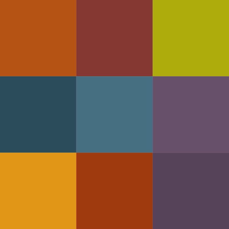
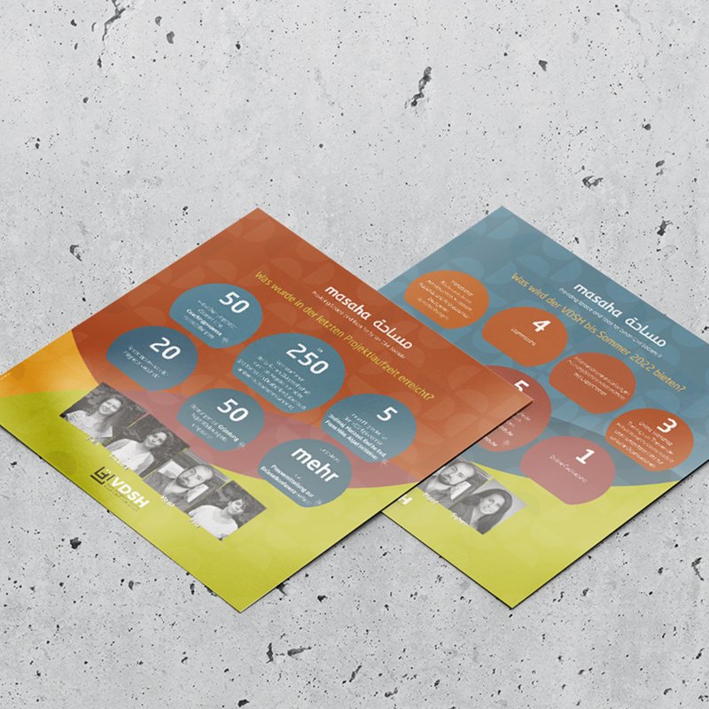
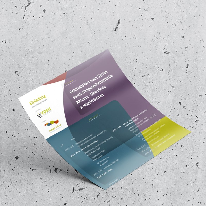
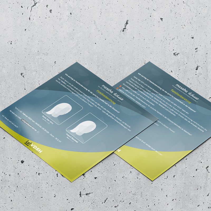
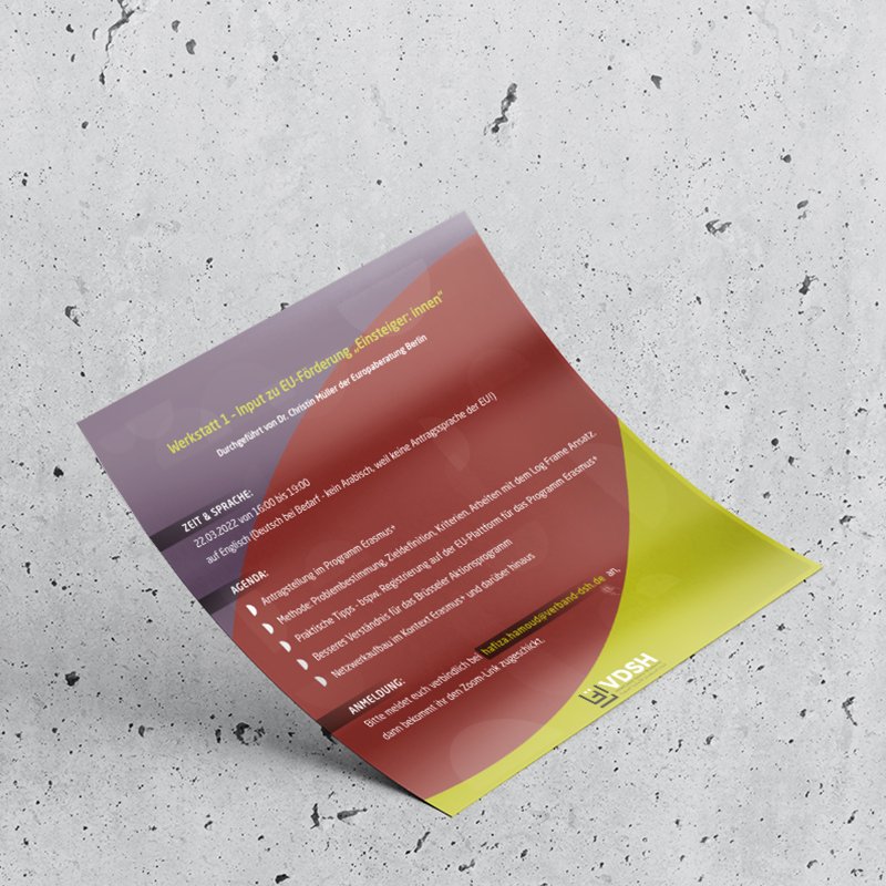
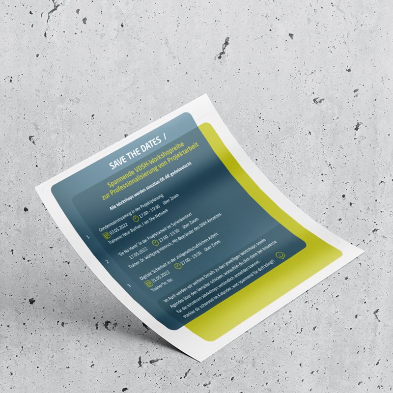
To reflect the diverse, dynamic nature of civil society initiatives, the project uses a rich, plural, and vivid color scheme. Moving away from rigid corporate tones, the palette blends warm terracotta, ochre gold, olive green, slate blue, deep teal, and plum purple. Applying semi-transparent layer effects allows these varied shades to overlap, creating new secondary tones that visually symbolize intersectionality, shared dialogue, and open collaboration. The resulting color grid feels warm, welcoming, and expressive while maintaining modern design standards. This versatile palette brings energy to digital platforms and printed publications, capturing the vibrant spirit of a community coming together.