Guverknow

2025
Manchester, United Kingdom
the philosophy: swarm intelligence
Research services often suffer from visual sterility—dominated by abstract data points, dry charts, and corporate clichés. To position Guverknow as a leading research authority in the MENA region, the brand strategy required a concept anchored in momentum and guidance rather than static numbers. Drawing from visual communication theory, the core philosophy centers on avian collective behavior. As captured in the foundational mood image, a flock moves cohesively behind a central lead bird navigating toward the light. This metaphor defines Guverknow's role: clearing the path and providing objective direction through complex research environments. Having contributed to the brand's inception in 2024—including co-naming the firm by blending "governance" and "knowledge"—this imagery forms both the structural and chromatic foundation of the identity, inspiring both the vector wing dynamics and the teal-to-warm gradient palette.

gvrn-pic01
gvrn-pic02
initial visual exploration
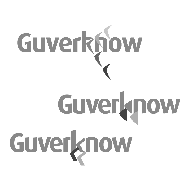
Translating an abstract organizational behavior—like flocking dynamics—into a functional corporate emblem required structural reduction. Early sketches focused on capturing aerodynamic force, directionality, and spatial balance. The primary challenge was avoiding literal representations of birds while retaining the structural essence of leadership within a group. These early iterations explored geometric forms, movement vectors, and optical weight to find a shape that felt both academic and modern. Iterating through manual drafts made it possible to isolate the exact geometric angles needed to communicate forward trajectory before moving to digital vector refinement.
deconstructing the form
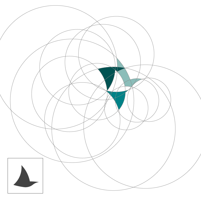
Once the core structural composition emerged—anchoring the lead bird form at the lower left—the process shifted from conceptual sketch to geometric construction. This phase involved deconstructing the mental concept into precise vector math. Using custom grid structures, intersecting arcs, and pathfinder operations, the outer borders were cut to balance negative space against solid volume. Refining the visual weight ensured the emblem remained recognizable and balanced across both micro-scale application (like web favicons) and large format presentation media.
gvrn-pic03
gvrn-pic04
logo mark & typography finalization
The finalized mark isolates the lead vector of the flock, creating a self-contained emblem that signifies guidance and analytical depth. To complement the mark's geometric structure, typography selection required a precise balance of technical rigor and approachable delivery. The Dax font family was selected for its distinct synthesis of sharp terminals and curved strokes. Its humanistic sans-serif geometry provides high readability for research publications while visually aligning with the curved dynamic of the mark.
strategic color palette
The color system reinforces Guverknow’s core value proposition: objective authority paired with client engagement. A deep teal-to-blue gradient serves as the dominant brand anchor, leveraging cold blue tones to communicate institutional trust, objectivity, and academic precision within the research sector. To counter the potential sterility of blue, a warm orange-yellow secondary accent was introduced. This contrast draws immediate focal attention to key data points while adding essential warmth to user touchpoints, balancing corporate credibility with approachable communication.
gvrn-pic05
gvrn-pic06
digital touchpoint (web deployment)
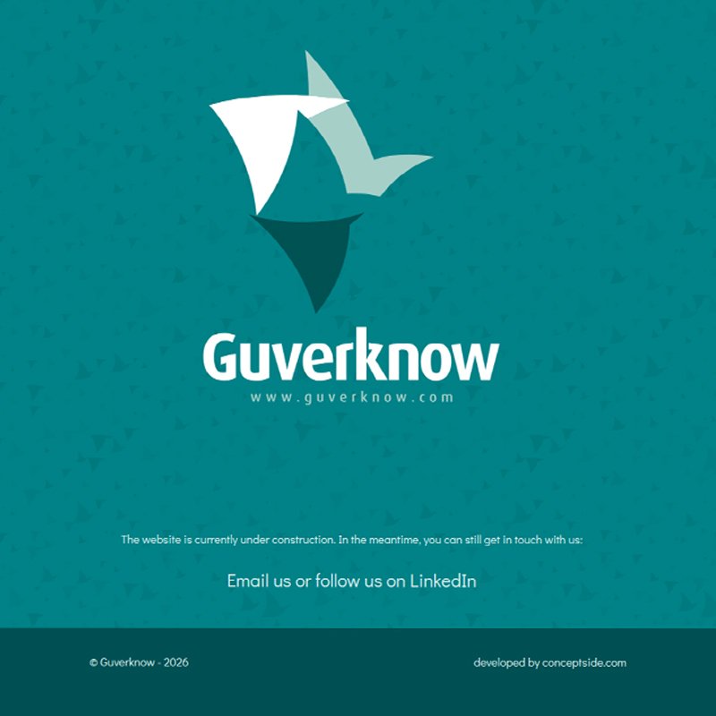
The digital expression of the brand is deployed at www.guverknow.com. Currently operating with an active holding environment, the landing page establishes early brand presence while core editorial content and structural hierarchies are finalized with the research team. The web architecture is structured around clean content delivery, prioritizing reading comfort and clear access to analytical reports—extending the core brand premise of clarity into the digital user experience.

Guverknow

2025
Manchester, United Kingdom
the philosophy: swarm intelligence
Research services often suffer from visual sterility—dominated by abstract data points, dry charts, and corporate clichés. To position Guverknow as a leading research authority in the MENA region, the brand strategy required a concept anchored in momentum and guidance rather than static numbers. Drawing from visual communication theory, the core philosophy centers on avian collective behavior. As captured in the foundational mood image, a flock moves cohesively behind a central lead bird navigating toward the light. This metaphor defines Guverknow's role: clearing the path and providing objective direction through complex research environments. Having contributed to the brand's inception in 2024—including co-naming the firm by blending "governance" and "knowledge"—this imagery forms both the structural and chromatic foundation of the identity, inspiring both the vector wing dynamics and the teal-to-warm gradient palette.

gvrn-pic01
initial visual exploration
Translating an abstract organizational behavior—like flocking dynamics—into a functional corporate emblem required structural reduction. Early sketches focused on capturing aerodynamic force, directionality, and spatial balance. The primary challenge was avoiding literal representations of birds while retaining the structural essence of leadership within a group. These early iterations explored geometric forms, movement vectors, and optical weight to find a shape that felt both academic and modern. Iterating through manual drafts made it possible to isolate the exact geometric angles needed to communicate forward trajectory before moving to digital vector refinement.
gvrn-pic02
deconstructing the form
Once the core structural composition emerged—anchoring the lead bird form at the lower left—the process shifted from conceptual sketch to geometric construction. This phase involved deconstructing the mental concept into precise vector math. Using custom grid structures, intersecting arcs, and pathfinder operations, the outer borders were cut to balance negative space against solid volume. Refining the visual weight ensured the emblem remained recognizable and balanced across both micro-scale application (like web favicons) and large format presentation media.
gvrn-pic03
logo mark & typography finalization
The finalized mark isolates the lead vector of the flock, creating a self-contained emblem that signifies guidance and analytical depth. To complement the mark's geometric structure, typography selection required a precise balance of technical rigor and approachable delivery. The Dax font family was selected for its distinct synthesis of sharp terminals and curved strokes. Its humanistic sans-serif geometry provides high readability for research publications while visually aligning with the curved dynamic of the mark.
gvrn-pic04
strategic color palette
The color system reinforces Guverknow’s core value proposition: objective authority paired with client engagement. A deep teal-to-blue gradient serves as the dominant brand anchor, leveraging cold blue tones to communicate institutional trust, objectivity, and academic precision within the research sector. To counter the potential sterility of blue, a warm orange-yellow secondary accent was introduced. This contrast draws immediate focal attention to key data points while adding essential warmth to user touchpoints, balancing corporate credibility with approachable communication.
gvrn-pic05
digital touchpoint (web deployment)
The digital expression of the brand is deployed at www.guverknow.com. Currently operating with an active holding environment, the landing page establishes early brand presence while core editorial content and structural hierarchies are finalized with the research team. The web architecture is structured around clean content delivery, prioritizing reading comfort and clear access to analytical reports—extending the core brand premise of clarity into the digital user experience.
gvrn-pic06

more insights about Guverknow

more insights about Guverknow