NOETA Academy

2025
Dubai, UAE
the "napkin" discovery phase
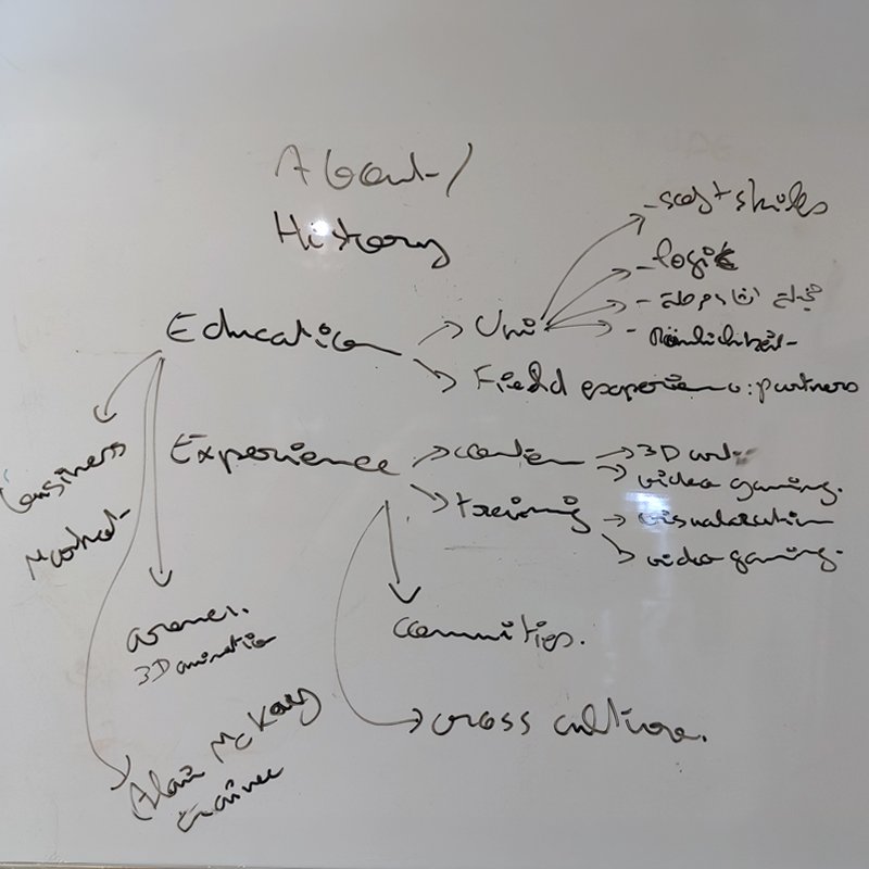
Establishing the brand identity for Dubai’s NOETA Academy required stepping away from saturated gaming tropes. While most digital media institutions rely on expected symbols like controllers or VR headsets, NOETA needed a position rooted in long-term industry value. Collaborating directly with the academy's executive director—a 3D artist—the foundational phase in 2024 began on a whiteboard. This mapping session deconstructed the academy’s structure across education, technical logic, market alignment, and hands-on production experience. By auditing the institution’s core purpose early on, the strategy shifted focus from the tools of gaming to the essence of creative mastery: empowering students to build, launch, and sustain their own original intellectual property.

noeta01-identity-brainstormin
noeta02-philosophy
conceptual philosophy: autonomy
The central visual philosophy draws direct inspiration from the classic adage: "Give a man a fish, he'll eat for a day; teach him how to fish, and he'll eat for a lifetime." In the fast-evolving entertainment and 3D industries, teaching software mechanics alone is insufficient. NOETA’s mission centers on mentorship and self-reliance, equipping creators with the underlying logic and problem-solving skills needed to navigate long-term careers. The concept grounds the brand in an elemental, human interaction—passing down a craft through guided discipline—distilling complex technical education into a universally recognizable story of mentorship and independent growth.
translating metaphor to visual elements
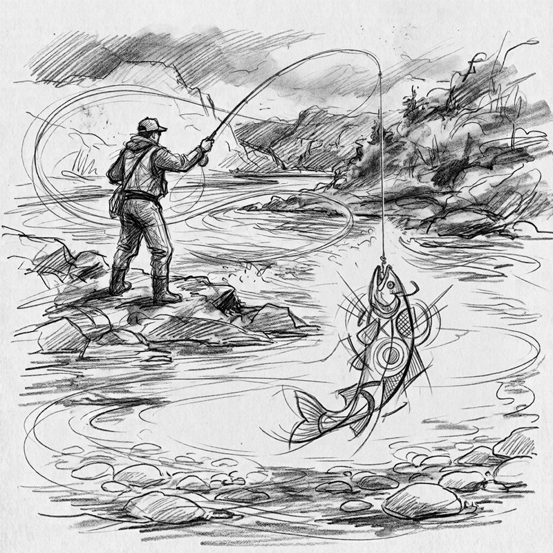
To bridge abstract philosophy with visual design, the core narrative was translated into narrative line art. The fishing line, tension curve, and dynamic strike of the catch represent the precise moment where technical training yields tangible creative results. Rather than treating the metaphor literally, the illustration phase explored the geometry of tension and motion. The curved sweep of the fishing line acts as a visual bridge between tutor and student, while the upward motion of the fish reflects active creation. This stage established the primary structural vectors needed to refine a complex narrative drawing into a minimal, high-impact brand mark.
noeta03-concept
noeta04-logo-cutout
geometric deconstruction
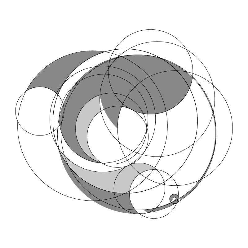
Creating a clean, memorable emblem from a narrative concept required strict mathematical reduction. Using a series of overlapping geometric circles and arcs, the dynamic forms of the fish and sweeping fishing line were deconstructed into precise vector shapes. The circular grid system establishes optical balance and proportional weight. By calculating negative space and overlapping line trajectories, the mark isolates the motion of the arc while maintaining structural unity. This geometric discipline ensures the mark functions seamlessly at any scale—from small app icons to large-scale environmental signage.
final mark & custom typography
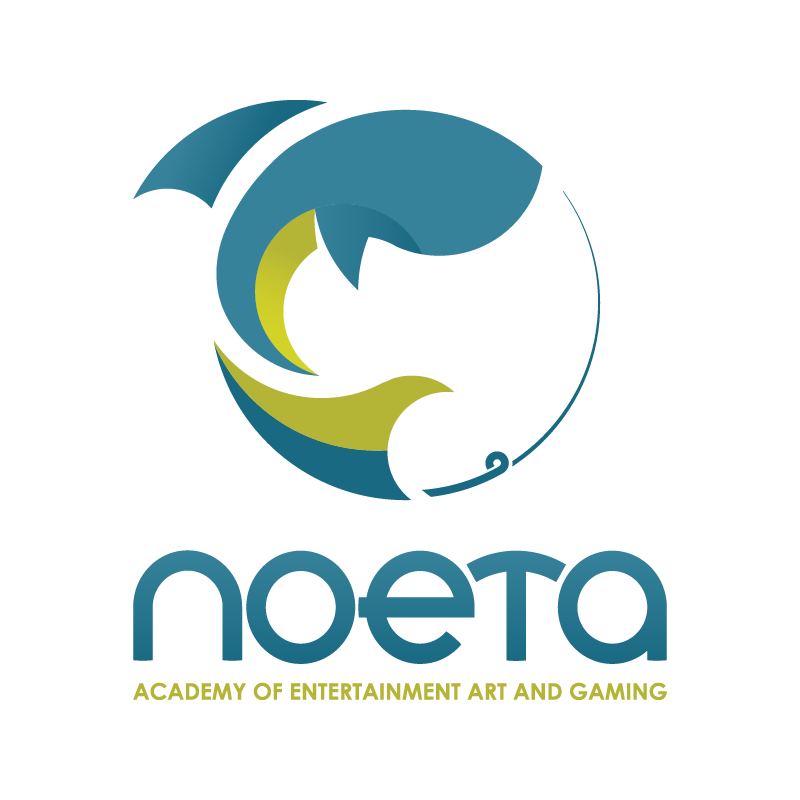
The finalized identity unites the fluid emblem with custom sans-serif logotype. The mark forms a enclosed circular rhythm where the sweeping fishing line frames the upward arc of the fish, balancing active energy with structural stability. Below the mark, the custom typography features rounded geometric terminals that mirror the curved cuts of the emblem, creating a cohesive visual unit. The descriptor "Academy of Entertainment Art and Gaming" anchors the logo, clearly defining the institution’s market category while maintaining a sophisticated, high-end educational aesthetic suitable for the UAE market.
noeta05-logo
noeta06-colors
strategic palette alignment
The color palette balances institutional credibility with creative energy. Deep teal and slate blue form the primary brand base, establishing a foundation of trust, technical precision, and academic authority essential for institutional partnerships. To inject energy appropriate for a premier gaming and 3D academy, vibrant lime green and olive tones were selected as secondary accents. This high-contrast pairing reflects the tension of the core metaphor—deep water paired with electric movement—providing a versatile color system for digital interfaces, marketing collateral, and dark-mode UI environments.

NOETA Academy

2025
Dubai, UAE
the "napkin" discovery phase
Establishing the brand identity for Dubai’s NOETA Academy required stepping away from saturated gaming tropes. While most digital media institutions rely on expected symbols like controllers or VR headsets, NOETA needed a position rooted in long-term industry value. Collaborating directly with the academy's executive director—a 3D artist—the foundational phase in 2024 began on a whiteboard. This mapping session deconstructed the academy’s structure across education, technical logic, market alignment, and hands-on production experience. By auditing the institution’s core purpose early on, the strategy shifted focus from the tools of gaming to the essence of creative mastery: empowering students to build, launch, and sustain their own original intellectual property.

noeta01-identity-brainstormin
conceptual philosophy: autonomy
The central visual philosophy draws direct inspiration from the classic adage: "Give a man a fish, he'll eat for a day; teach him how to fish, and he'll eat for a lifetime." In the fast-evolving entertainment and 3D industries, teaching software mechanics alone is insufficient. NOETA’s mission centers on mentorship and self-reliance, equipping creators with the underlying logic and problem-solving skills needed to navigate long-term careers. The concept grounds the brand in an elemental, human interaction—passing down a craft through guided discipline—distilling complex technical education into a universally recognizable story of mentorship and independent growth.
noeta02-philosophy
translating metaphor to visual elements
To bridge abstract philosophy with visual design, the core narrative was translated into narrative line art. The fishing line, tension curve, and dynamic strike of the catch represent the precise moment where technical training yields tangible creative results. Rather than treating the metaphor literally, the illustration phase explored the geometry of tension and motion. The curved sweep of the fishing line acts as a visual bridge between tutor and student, while the upward motion of the fish reflects active creation. This stage established the primary structural vectors needed to refine a complex narrative drawing into a minimal, high-impact brand mark.
noeta03-concept
geometric deconstruction
Creating a clean, memorable emblem from a narrative concept required strict mathematical reduction. Using a series of overlapping geometric circles and arcs, the dynamic forms of the fish and sweeping fishing line were deconstructed into precise vector shapes. The circular grid system establishes optical balance and proportional weight. By calculating negative space and overlapping line trajectories, the mark isolates the motion of the arc while maintaining structural unity. This geometric discipline ensures the mark functions seamlessly at any scale—from small app icons to large-scale environmental signage.
noeta04-logo-cutout
final mark & custom typography
The finalized identity unites the fluid emblem with custom sans-serif logotype. The mark forms a enclosed circular rhythm where the sweeping fishing line frames the upward arc of the fish, balancing active energy with structural stability. Below the mark, the custom typography features rounded geometric terminals that mirror the curved cuts of the emblem, creating a cohesive visual unit. The descriptor "Academy of Entertainment Art and Gaming" anchors the logo, clearly defining the institution’s market category while maintaining a sophisticated, high-end educational aesthetic suitable for the UAE market.
noeta05-logo
strategic palette alignment
The color palette balances institutional credibility with creative energy. Deep teal and slate blue form the primary brand base, establishing a foundation of trust, technical precision, and academic authority essential for institutional partnerships. To inject energy appropriate for a premier gaming and 3D academy, vibrant lime green and olive tones were selected as secondary accents. This high-contrast pairing reflects the tension of the core metaphor—deep water paired with electric movement—providing a versatile color system for digital interfaces, marketing collateral, and dark-mode UI environments.
noeta06-colors

more insights about NOETA Academy

more insights about NOETA Academy