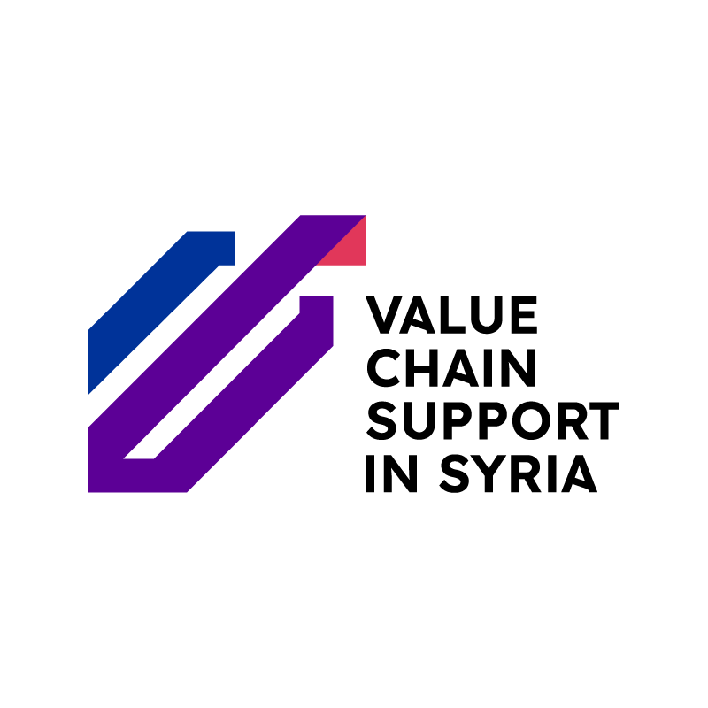
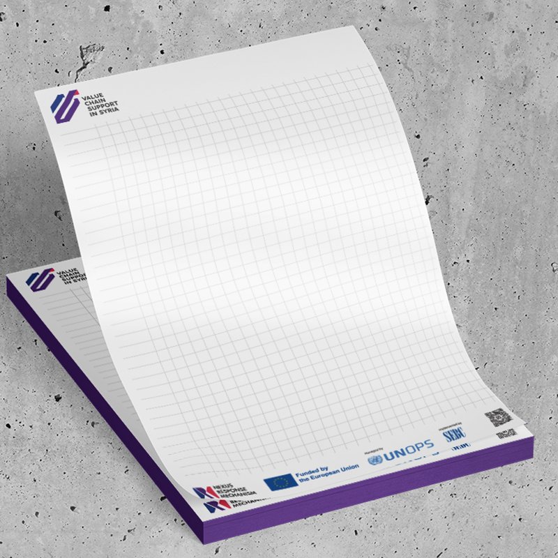
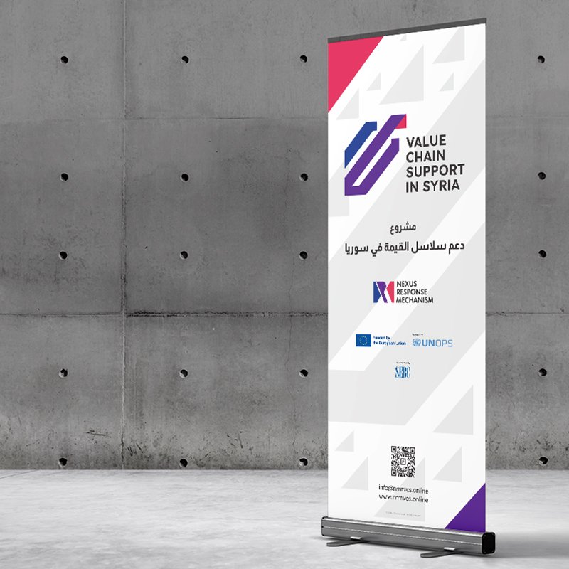
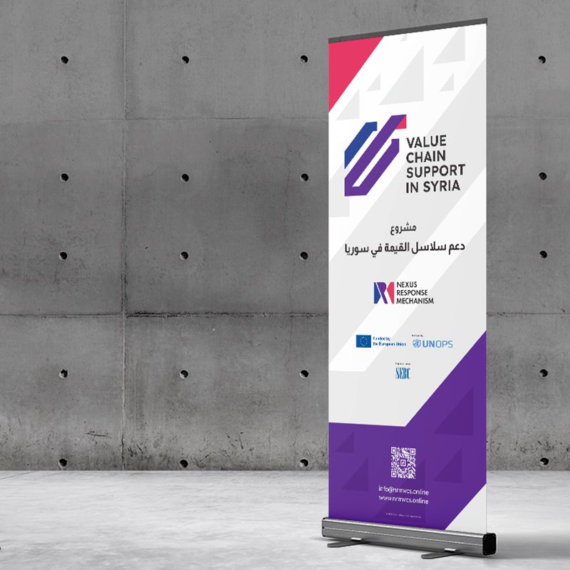
The finalized mark features sharp, geometric edges that convey institutional stability, transparency, and operational rigor. The interlocking linear bands visually represent the value chain concept—connecting local production to broader market opportunities.
Accompanying the mark is a solid, highly legible geometric sans-serif logotype stacked in four clean lines. The typographic hierarchy balances the visual weight of the emblem, delivering a clear, authoritative presence suitable for multi-stakeholder communication across international development partners, local communities, and private-sector beneficiaries.