DTC-Global

2026
Darmstadt, Germany
sketch & concept
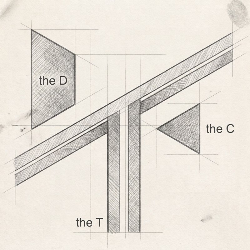
To meet the client's vision for a sharp, dynamic identity, the concept explores spatial perspective and dimensional letterforms. This initial sketch breaks down the acronym DTC—standing for Development, Training, Consultancy—into angular geometric planes. By projecting each letter along slanting construction lines, the monogram achieves a sense of upward depth and forward momentum. The letter "D" forms the top left structure, "T" creates the central pillar, and "C" acts as the angular wedge below. This pencil study lays the spatial groundwork, transforming standard typographic initials into a sharp, architectural emblem that symbolizes growth, structural strategy, and global perspective.
dtc01
dtc02
isometric grid construction
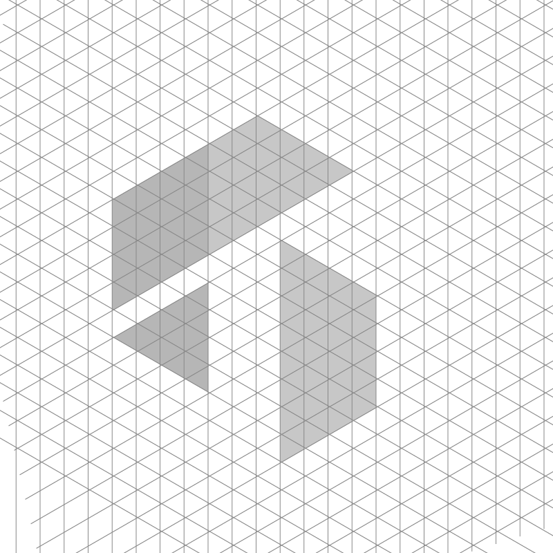
To translate the perspective sketch into a precise vector icon, I plotted the mark on an isometric 60-degree grid. This mathematical framework ensures perfect alignment, consistent parallel angles, and uniform spatial relationships across all facets. Filling specific triangular grid modules creates a clean isometric cube illusion, defining the abstract "DTC" letterforms within a cohesive three-dimensional structure. The grid cutout phase bridges artistic intuition and technical design, establishing balanced proportions that scale seamlessly across digital screens and printed materials while preserving the sharp, structured perspective requested by the client.
final logo lockup
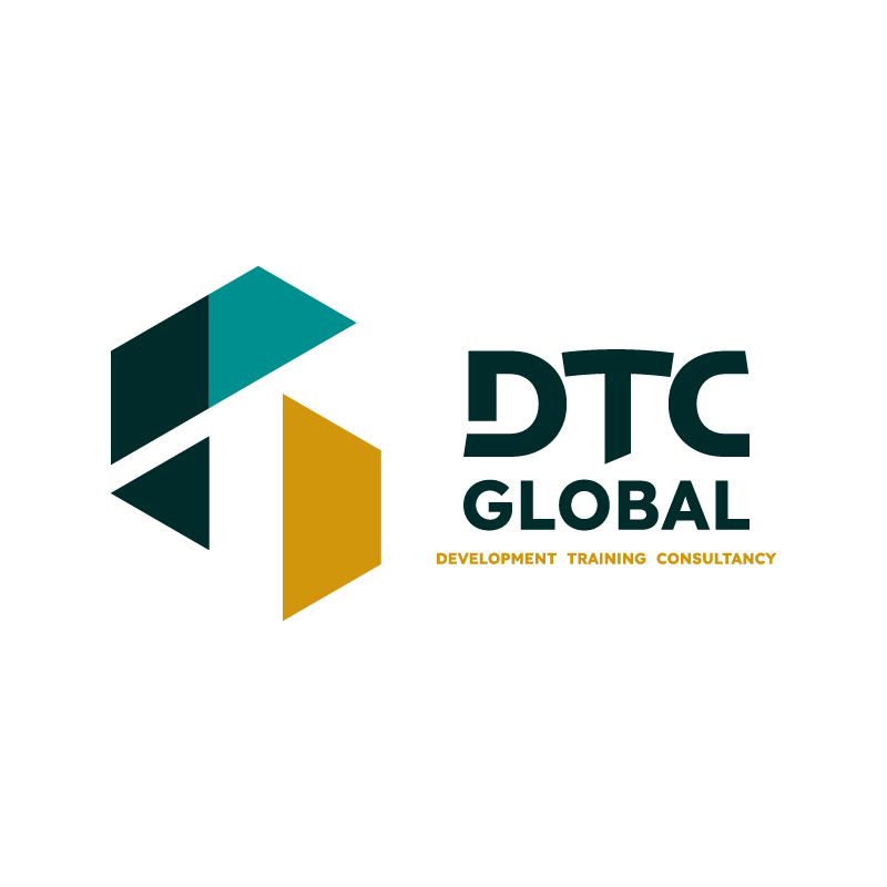
The final logo pairs the three-dimensional geometric symbol with strong, customized typography. The main mark features bold, angular letterforms for "DTC" and "GLOBAL," echoing the sharp cuts of the icon. Beneath, the full title—DEVELOPMENT TRAINING CONSULTANCY—anchors the design in a clean, legible sans-serif font. The spatial arrangement creates strong visual equilibrium, positioning the faceted cube-like symbol alongside the structured typography. This clean lockup communicates modern efficiency, structural stability, and strategic focus, providing DTC-Global with an authoritative, future-oriented brand identity suitable for international consulting services.
dtc03
dtc04
color palette
The color palette balances professional authority with an approachable, modern energetic touch. Deep forest green serves as the primary base, evoking trust, stability, corporate integrity, and expertise. Light teal green adds a fresh, vibrant contrast that highlights the top facets of the geometric icon, symbolizing innovation, growth, and continuous development. Complementing these cool tones is a warm mustard yellow, which brings a distinctive accent to the right plane and lower subtitle. This warm touch introduces warmth, creativity, and energy, ensuring the visual identity stands out while maintaining an inviting, high-level corporate aesthetic.

temporary landing page
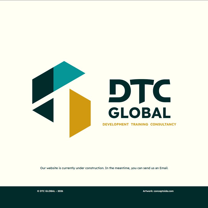
To maintain a professional online presence during platform development, I designed a minimal temporary landing page. The layout centers the complete brand lockup against a warm, neutral off-white background, providing a clean visual focal point. Clear notification text informs visitors that the website is currently under construction, accompanied by an invitation to reach out via email. A deep forest green footer bar grounds the page, echoing the primary brand shade and framing the content neatly. This temporary digital solution establishes immediate brand credibility and functional contact access while the full site is built.
dtc05

DTC-Global

2026
Darmstadt, Germany
sketch & concept
To meet the client's vision for a sharp, dynamic identity, the concept explores spatial perspective and dimensional letterforms. This initial sketch breaks down the acronym DTC—standing for Development, Training, Consultancy—into angular geometric planes. By projecting each letter along slanting construction lines, the monogram achieves a sense of upward depth and forward momentum. The letter "D" forms the top left structure, "T" creates the central pillar, and "C" acts as the angular wedge below. This pencil study lays the spatial groundwork, transforming standard typographic initials into a sharp, architectural emblem that symbolizes growth, structural strategy, and global perspective.
dtc01
isometric grid construction
To translate the perspective sketch into a precise vector icon, I plotted the mark on an isometric 60-degree grid. This mathematical framework ensures perfect alignment, consistent parallel angles, and uniform spatial relationships across all facets. Filling specific triangular grid modules creates a clean isometric cube illusion, defining the abstract "DTC" letterforms within a cohesive three-dimensional structure. The grid cutout phase bridges artistic intuition and technical design, establishing balanced proportions that scale seamlessly across digital screens and printed materials while preserving the sharp, structured perspective requested by the client.
dtc02
final logo lockup
The final logo pairs the three-dimensional geometric symbol with strong, customized typography. The main mark features bold, angular letterforms for "DTC" and "GLOBAL," echoing the sharp cuts of the icon. Beneath, the full title—DEVELOPMENT TRAINING CONSULTANCY—anchors the design in a clean, legible sans-serif font. The spatial arrangement creates strong visual equilibrium, positioning the faceted cube-like symbol alongside the structured typography. This clean lockup communicates modern efficiency, structural stability, and strategic focus, providing DTC-Global with an authoritative, future-oriented brand identity suitable for international consulting services.
dtc03
color palette
The color palette balances professional authority with an approachable, modern energetic touch. Deep forest green serves as the primary base, evoking trust, stability, corporate integrity, and expertise. Light teal green adds a fresh, vibrant contrast that highlights the top facets of the geometric icon, symbolizing innovation, growth, and continuous development. Complementing these cool tones is a warm mustard yellow, which brings a distinctive accent to the right plane and lower subtitle. This warm touch introduces warmth, creativity, and energy, ensuring the visual identity stands out while maintaining an inviting, high-level corporate aesthetic.

dtc04
temporary landing page
To maintain a professional online presence during platform development, I designed a minimal temporary landing page. The layout centers the complete brand lockup against a warm, neutral off-white background, providing a clean visual focal point. Clear notification text informs visitors that the website is currently under construction, accompanied by an invitation to reach out via email. A deep forest green footer bar grounds the page, echoing the primary brand shade and framing the content neatly. This temporary digital solution establishes immediate brand credibility and functional contact access while the full site is built.
dtc05