German Syrian Organization

2026
Darmstadt, Germany
grid & logo construction
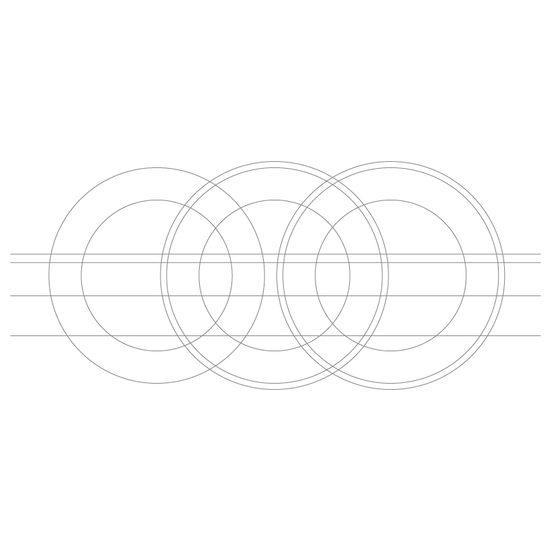
To fulfill the client's request for a clear, direct, and memorable identity, the design process began with geometric simplicity. The concept builds upon the three initials of the German Syrian Organization ("GSO"), representing them as three repeating, overlapping circular forms. To refine these shapes into stylized letterforms, horizontal cutting planes slice off the bottom portion of each circle. This precise vector construction transforms standard circles into three interconnected arches with inner horizontal terminals. By linking the three letters together in a continuous geometric flow, the design establishes structural unity. This mechanical cutout process highlights the balance between systematic vector precision and clean minimalist typography, giving the brand a bold, functional foundation.
gso01
gso02
final brand lockup
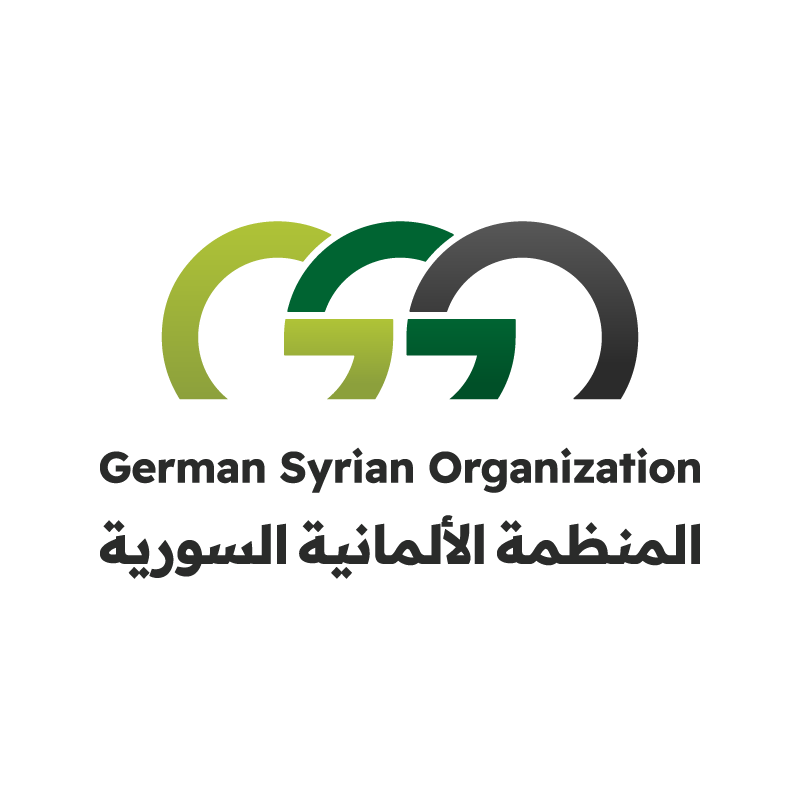
The final brand mark pairs the linked monogram with strong bilingual typography. The three overarching letterforms merge seamless visual continuity with distinct modern appeal. Below the central emblem, the organization's full title is presented in both English (German Syrian Organization) and Arabic (المنظمة الألمانية السورية). The clean sans-serif Latin font matches the geometric weight of the Arabic script, creating visual parity between both languages. The horizontal orientation of the integrated "GSO" symbol suggests bridging, collaboration, and structured support across communities. This direct, uncluttered composition ensures maximum legibility and strong brand recognition across diverse mediums, from formal institutional correspondence to digital media profiles and printed materials.
color palette
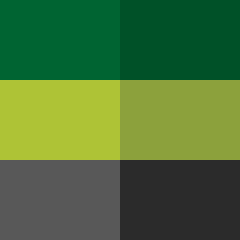
The color palette was chosen to convey institutional trust, stability, and ongoing prosperity. Dark charcoal gray grounds the composition, offering strong contrast, modern clarity, and formal balance. Deep emerald green and vibrant olive green bring life to the icon, symbolizing growth, renewal, health, and sustainable development. Gray evokes organizational reliability and professional authority, while the contrasting green shades add energy and optimism. This organic color pairing reflects the collaborative nature of the organization, representing a harmonious relationship between tradition and progress. The resulting scheme is versatile and visually striking, providing a welcoming yet sophisticated aesthetic for all brand applications across online and print platforms.

gso03
gso04
landing page & under construction
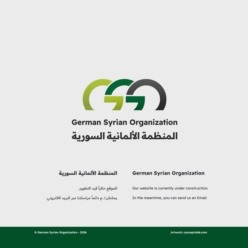
To establish an immediate online presence while the full digital platform was being developed, I designed a clean, functional landing page. The interface places the main bilingual logo mark prominently at the center, ensuring immediate brand recognition. Below, concise bilingual copy informs visitors that the website is currently under construction while providing a direct call to action to reach out via email. The layout utilizes generous white space, centered alignment, and a solid deep green footer bar that mirrors the brand's primary color. This minimal layout serves as an effective temporary visual anchor, maintaining high professional standards, clarity, and accessibility across all screen sizes while the complete website undergoes development.

German Syrian Organization

2026
Darmstadt, Germany
grid & logo construction
To fulfill the client's request for a clear, direct, and memorable identity, the design process began with geometric simplicity. The concept builds upon the three initials of the German Syrian Organization ("GSO"), representing them as three repeating, overlapping circular forms. To refine these shapes into stylized letterforms, horizontal cutting planes slice off the bottom portion of each circle. This precise vector construction transforms standard circles into three interconnected arches with inner horizontal terminals. By linking the three letters together in a continuous geometric flow, the design establishes structural unity. This mechanical cutout process highlights the balance between systematic vector precision and clean minimalist typography, giving the brand a bold, functional foundation.
gso01
final brand lockup
The final brand mark pairs the linked monogram with strong bilingual typography. The three overarching letterforms merge seamless visual continuity with distinct modern appeal. Below the central emblem, the organization's full title is presented in both English (German Syrian Organization) and Arabic (المنظمة الألمانية السورية). The clean sans-serif Latin font matches the geometric weight of the Arabic script, creating visual parity between both languages. The horizontal orientation of the integrated "GSO" symbol suggests bridging, collaboration, and structured support across communities. This direct, uncluttered composition ensures maximum legibility and strong brand recognition across diverse mediums, from formal institutional correspondence to digital media profiles and printed materials.
gso02
color palette
The color palette was chosen to convey institutional trust, stability, and ongoing prosperity. Dark charcoal gray grounds the composition, offering strong contrast, modern clarity, and formal balance. Deep emerald green and vibrant olive green bring life to the icon, symbolizing growth, renewal, health, and sustainable development. Gray evokes organizational reliability and professional authority, while the contrasting green shades add energy and optimism. This organic color pairing reflects the collaborative nature of the organization, representing a harmonious relationship between tradition and progress. The resulting scheme is versatile and visually striking, providing a welcoming yet sophisticated aesthetic for all brand applications across online and print platforms.

gso03
landing page & under construction
To establish an immediate online presence while the full digital platform was being developed, I designed a clean, functional landing page. The interface places the main bilingual logo mark prominently at the center, ensuring immediate brand recognition. Below, concise bilingual copy informs visitors that the website is currently under construction while providing a direct call to action to reach out via email. The layout utilizes generous white space, centered alignment, and a solid deep green footer bar that mirrors the brand's primary color. This minimal layout serves as an effective temporary visual anchor, maintaining high professional standards, clarity, and accessibility across all screen sizes while the complete website undergoes development.
gso04