masaha

2020
Berlin, Germany
concept sketch
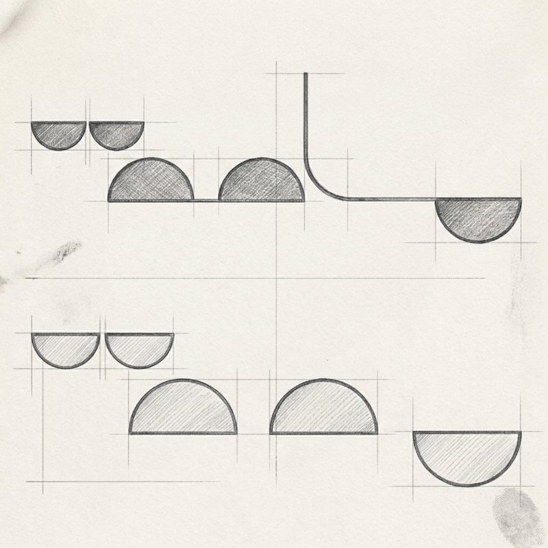
The design concept for Masaha (meaning "space" in Arabic) relies on clever typographic abstraction. Rather than drafting traditional letterforms, I traced the negative spaces, counters, and voids created by the Arabic calligraphic script of the word "مساحة". By isolating these internal geometric shapes—primarily rounded semicircles and arches—the negative space itself becomes the primary structural element. This technical grid sketch illustrates how the underlying spatial flow of Arabic typography is extracted and organized into balanced geometric forms. The design directly reflects the name of the project: creating a physical and symbolic "space" by transforming the open, unseen areas surrounding the word into an intriguing, harmonious visual unit.
masaha01
masaha02
final lockup
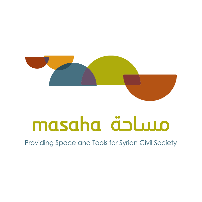
The final logo lockup pairs the abstract geometric mark with clean bilingual typography. Overlapping translucent semicircles correspond to the negative spaces of the Arabic word, creating depth where colors intersect. Positioned below the mark is the dual-language title: the Latin "masaha" matched seamlessly with its custom Arabic counterpart "مساحة" in a modern, rounded typographic style. Underneath, the English tagline—Providing Space and Tools for Syrian Civil Society—anchors the emblem, clearly communicating the project's supportive mission. The overall composition strikes a refined balance between abstract artistic expression and institutional clarity, resulting in a memorable brand identity that represents civil society collaboration.
color palette
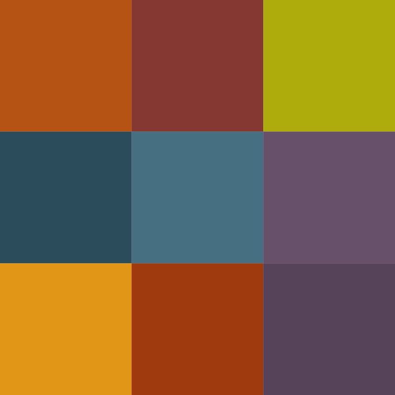
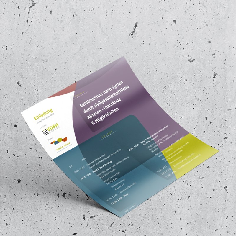
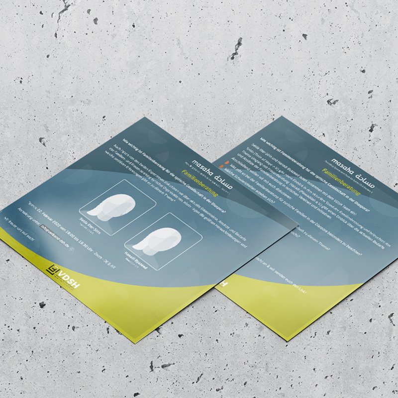
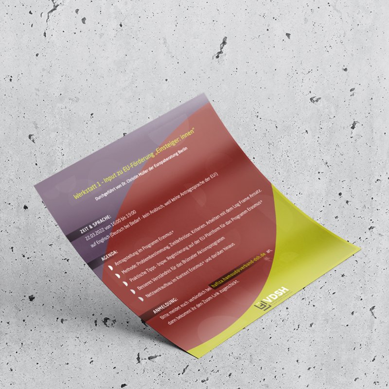
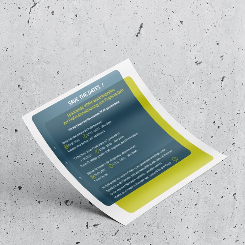
To reflect the diverse, dynamic nature of civil society initiatives, the project uses a rich, plural, and vivid color scheme. Moving away from rigid corporate tones, the palette blends warm terracotta, ochre gold, olive green, slate blue, deep teal, and plum purple. Applying semi-transparent layer effects allows these varied shades to overlap, creating new secondary tones that visually symbolize intersectionality, shared dialogue, and open collaboration. The resulting color grid feels warm, welcoming, and expressive while maintaining modern design standards. This versatile palette brings energy to digital platforms and printed publications, capturing the vibrant spirit of a community coming together.

masaha03

masaha

2020
Berlin, Germany
concept sketch
The design concept for Masaha (meaning "space" in Arabic) relies on clever typographic abstraction. Rather than drafting traditional letterforms, I traced the negative spaces, counters, and voids created by the Arabic calligraphic script of the word "مساحة". By isolating these internal geometric shapes—primarily rounded semicircles and arches—the negative space itself becomes the primary structural element. This technical grid sketch illustrates how the underlying spatial flow of Arabic typography is extracted and organized into balanced geometric forms. The design directly reflects the name of the project: creating a physical and symbolic "space" by transforming the open, unseen areas surrounding the word into an intriguing, harmonious visual unit.
masaha01
final lockup
The final logo lockup pairs the abstract geometric mark with clean bilingual typography. Overlapping translucent semicircles correspond to the negative spaces of the Arabic word, creating depth where colors intersect. Positioned below the mark is the dual-language title: the Latin "masaha" matched seamlessly with its custom Arabic counterpart "مساحة" in a modern, rounded typographic style. Underneath, the English tagline—Providing Space and Tools for Syrian Civil Society—anchors the emblem, clearly communicating the project's supportive mission. The overall composition strikes a refined balance between abstract artistic expression and institutional clarity, resulting in a memorable brand identity that represents civil society collaboration.
masaha02
color palette
To reflect the diverse, dynamic nature of civil society initiatives, the project uses a rich, plural, and vivid color scheme. Moving away from rigid corporate tones, the palette blends warm terracotta, ochre gold, olive green, slate blue, deep teal, and plum purple. Applying semi-transparent layer effects allows these varied shades to overlap, creating new secondary tones that visually symbolize intersectionality, shared dialogue, and open collaboration. The resulting color grid feels warm, welcoming, and expressive while maintaining modern design standards. This versatile palette brings energy to digital platforms and printed publications, capturing the vibrant spirit of a community coming together.

masaha03

more insights about masaha

more insights about masaha