WASL

2019
Berlin, Germany
inspiration
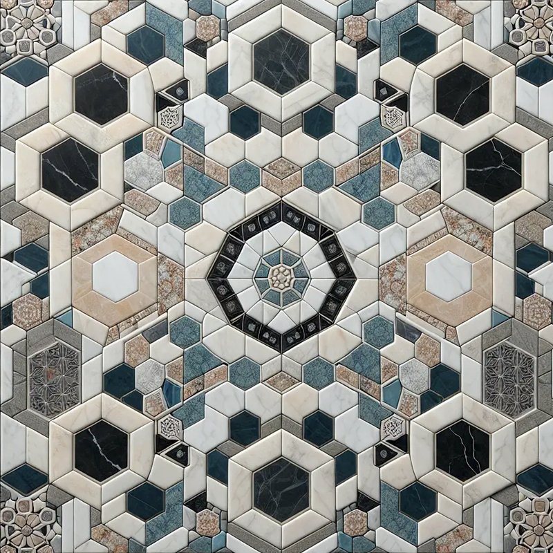
The word WASL translates to "connection," reflecting the project's mission of building a strong civil society network among Syrian organizations across Europe. To express this sense of unity visually, I drew inspiration from traditional Syrian artisan craftsmanship: geometric mosaic artwork and the classic star motif. Mosaics represent how distinct individual tiles come together to form a rich, harmonious composition—a natural metaphor for civil society networks. By studying historical geometric patterns, the initial concept focused on transforming heritage artisan motifs into a modern structural framework. This foundation honors cultural identity while creating a symbolic language of interconnection, collaboration, and community resilience that bridges traditions with contemporary European context.
wasl01
wasl02
territorial synthesis
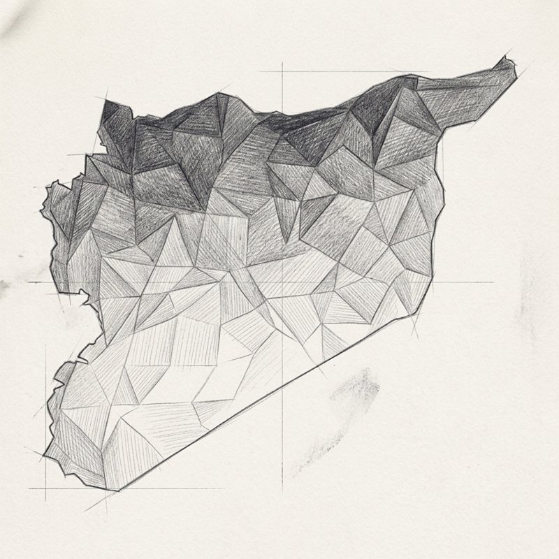
To ground the abstract mosaic concept in a clear geographical identity, the visual design integrates the outline of the Syrian map directly into the logo unit. This sketch shows the process of breaking down the country's national borders into an interconnected mesh of geometric polygons. Rather than relying on a rigid geographical outline, the map is rendered as a stylized mosaic structure, where each facet represents an active organization or community initiative within the diaspora. Constructing the map through faceted geometry establishes a dual meaning: it preserves the recognizable silhouette of Syria while transforming it into a dynamic, flexible network built from individual, interconnected efforts across European borders.
final lockup
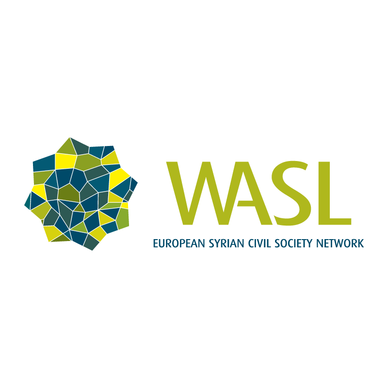
The final brand lockup brings the oriental motif and mosaic map together into a balanced star-like emblem. Embedded within the geometric rosette is the stylized shape of Syria, assembled from multi-faceted tile shapes that create a sense of depth and movement. Positioned alongside the symbol is modern, clean typography featuring the bold main mark "WASL" and the descriptive English subtitle European Syrian Civil Society Network. This composition creates a professional identity that feels both rooted in cultural heritage and forward-looking. The logo functions as a unifying seal, representing a bridge between Syrian diaspora civil initiatives and their institutional presence across Europe.
wasl03
wasl04
color palette
The color strategy draws direct inspiration from official European symbolism, adapting classic blue and yellow tones to reflect the network's European operational context. To establish a modern identity, the palette refines standard primary colors into a sophisticated spectrum of deep teal, rich navy, olive green, and vibrant yellow. The contrasting cool and warm shades emphasize the individual mosaic tiles within the logo mark, ensuring the geometric pattern remains distinct and readable. By blending European visual cues with warm accent tones, the color scheme visually represents the dialogue between Syrian community roots and European integration, establishing a cohesive look across all digital and print materials.

In and cover design, 116 pages, 148x210 mm., English & Arabic - 2020
wasl05
best practice booklet
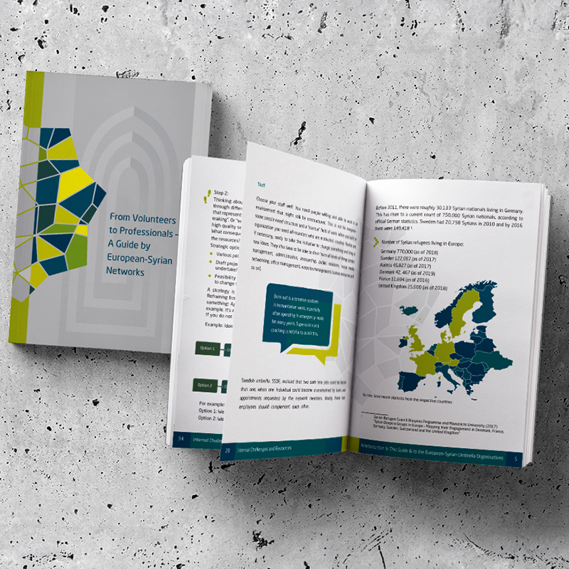
To extend the brand identity into editorial design, I designed the official best practice guide, titled From Volunteers to Professionals—A Guide by European-Syrian Networks, published in both English and Arabic. The layout translates the geometric visual identity onto publication covers and internal page spreads. Utilizing the mosaic emblem as a framing device on the cover, the design incorporates structured grid layouts, customized map infographics, and highlighted callout boxes using the established brand colors. Producing bilingual versions required careful attention to editorial typography and layout alignment, ensuring seamless readability in both left-to-right English and right-to-left Arabic formatting while maintaining consistent brand integrity.

WASL

2019
Berlin, Germany
inspiration
The word WASL translates to "connection," reflecting the project's mission of building a strong civil society network among Syrian organizations across Europe. To express this sense of unity visually, I drew inspiration from traditional Syrian artisan craftsmanship: geometric mosaic artwork and the classic star motif. Mosaics represent how distinct individual tiles come together to form a rich, harmonious composition—a natural metaphor for civil society networks. By studying historical geometric patterns, the initial concept focused on transforming heritage artisan motifs into a modern structural framework. This foundation honors cultural identity while creating a symbolic language of interconnection, collaboration, and community resilience that bridges traditions with contemporary European context.
wasl01
territorial synthesis
To ground the abstract mosaic concept in a clear geographical identity, the visual design integrates the outline of the Syrian map directly into the logo unit. This sketch shows the process of breaking down the country's national borders into an interconnected mesh of geometric polygons. Rather than relying on a rigid geographical outline, the map is rendered as a stylized mosaic structure, where each facet represents an active organization or community initiative within the diaspora. Constructing the map through faceted geometry establishes a dual meaning: it preserves the recognizable silhouette of Syria while transforming it into a dynamic, flexible network built from individual, interconnected efforts across European borders.
wasl02
final lockup
The final brand lockup brings the oriental motif and mosaic map together into a balanced star-like emblem. Embedded within the geometric rosette is the stylized shape of Syria, assembled from multi-faceted tile shapes that create a sense of depth and movement. Positioned alongside the symbol is modern, clean typography featuring the bold main mark "WASL" and the descriptive English subtitle European Syrian Civil Society Network. This composition creates a professional identity that feels both rooted in cultural heritage and forward-looking. The logo functions as a unifying seal, representing a bridge between Syrian diaspora civil initiatives and their institutional presence across Europe.
wasl03
color palette
The color strategy draws direct inspiration from official European symbolism, adapting classic blue and yellow tones to reflect the network's European operational context. To establish a modern identity, the palette refines standard primary colors into a sophisticated spectrum of deep teal, rich navy, olive green, and vibrant yellow. The contrasting cool and warm shades emphasize the individual mosaic tiles within the logo mark, ensuring the geometric pattern remains distinct and readable. By blending European visual cues with warm accent tones, the color scheme visually represents the dialogue between Syrian community roots and European integration, establishing a cohesive look across all digital and print materials.

wasl04
In and cover design, 116 pages, 148x210 mm., English & Arabic - 2020
wasl05
best practice booklet
To extend the brand identity into editorial design, I designed the official best practice guide, titled From Volunteers to Professionals—A Guide by European-Syrian Networks, published in both English and Arabic. The layout translates the geometric visual identity onto publication covers and internal page spreads. Utilizing the mosaic emblem as a framing device on the cover, the design incorporates structured grid layouts, customized map infographics, and highlighted callout boxes using the established brand colors. Producing bilingual versions required careful attention to editorial typography and layout alignment, ensuring seamless readability in both left-to-right English and right-to-left Arabic formatting while maintaining consistent brand integrity.