reelink media

2020
Berlin, Germany
strategic foundation & naming
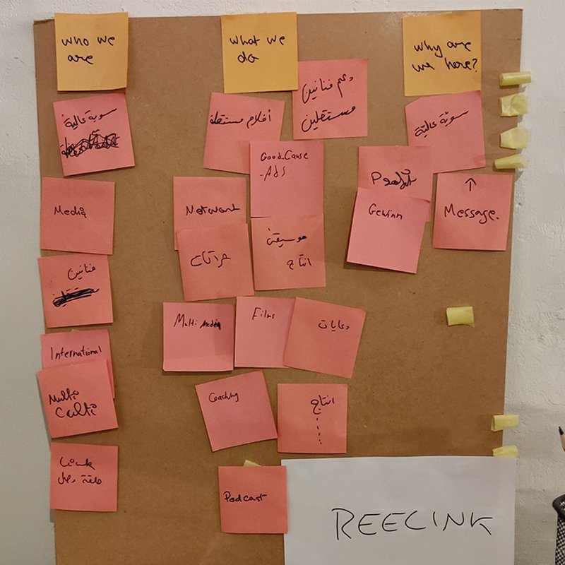
Designing an identity for one's own company—the classic "designer syndrome"—requires stepping back to analyze core purpose objectifying intent. As a co-founding team member based in Berlin's vibrant multimedia production hub, the initial phase focused on defining mission scope: supporting independent artists, producing high-quality film, podcasting, and creating impact-driven media for good causes. This workshop phase yielded the brand name "reelink"—a seamless linguistic fusion of "reel" (audio/visual production) and "link" (connectivity and community). The sticky-note board established the foundational imperative: build a brand mark that visually embodies connection without compromising the independence of either element.
reelink01
reelink02
early visual explorations
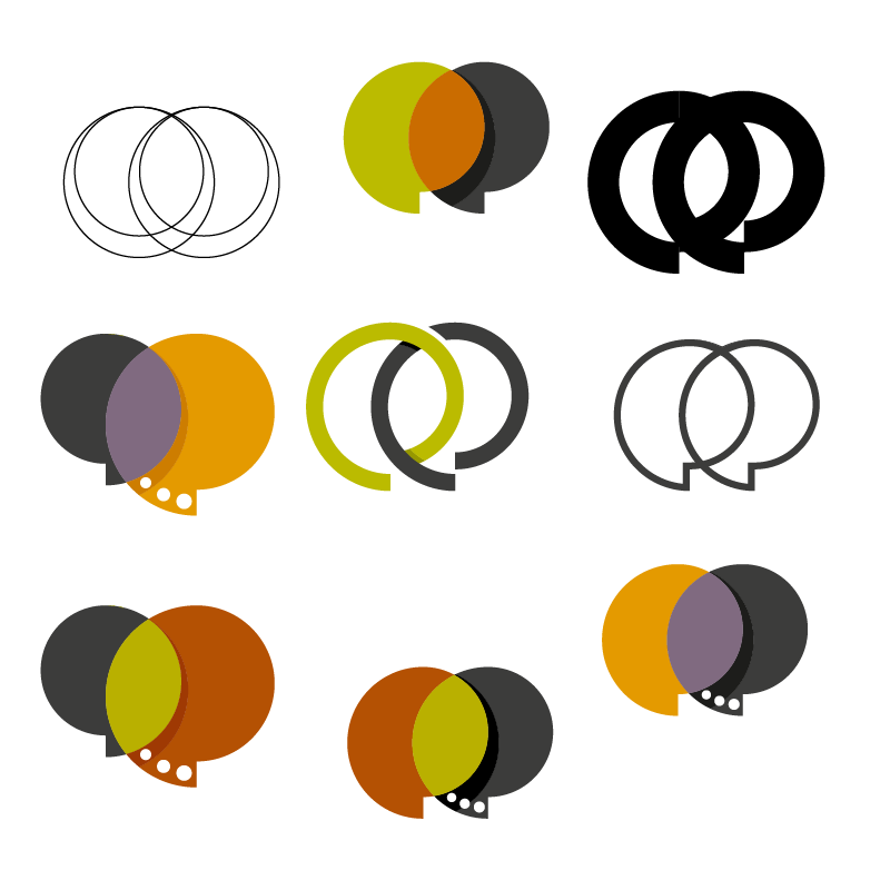
The exploration phase focused intensely on the central visual engine of the name: the twin letter "e"s in "reelink." Early draft iterations tested various geometric manifestations of interlock, transparency, and dialogue dynamics. Concepts ranged from speech bubbles and overlapping lens apertures to continuous loops and camera reels. Through these variations, the design target shifted toward capturing a dual state—two distinct shapes that merge to create a shared secondary space without obscuring their individual forms. This stage isolated the core motif: creating a link where the counter-spaces of the letterforms become the primary visual narrative.
"eureka" resolving the core mark
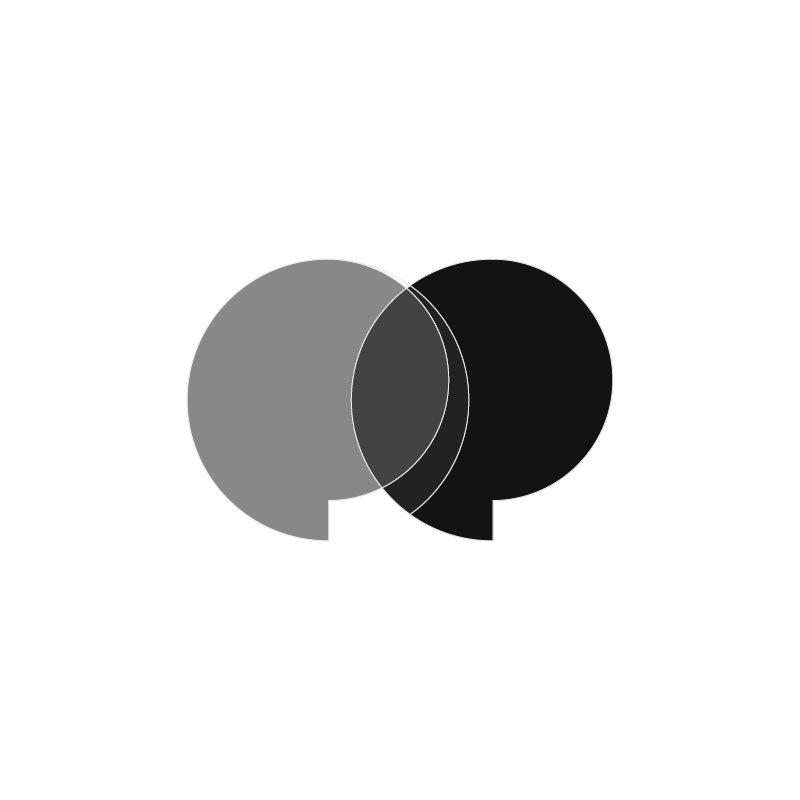
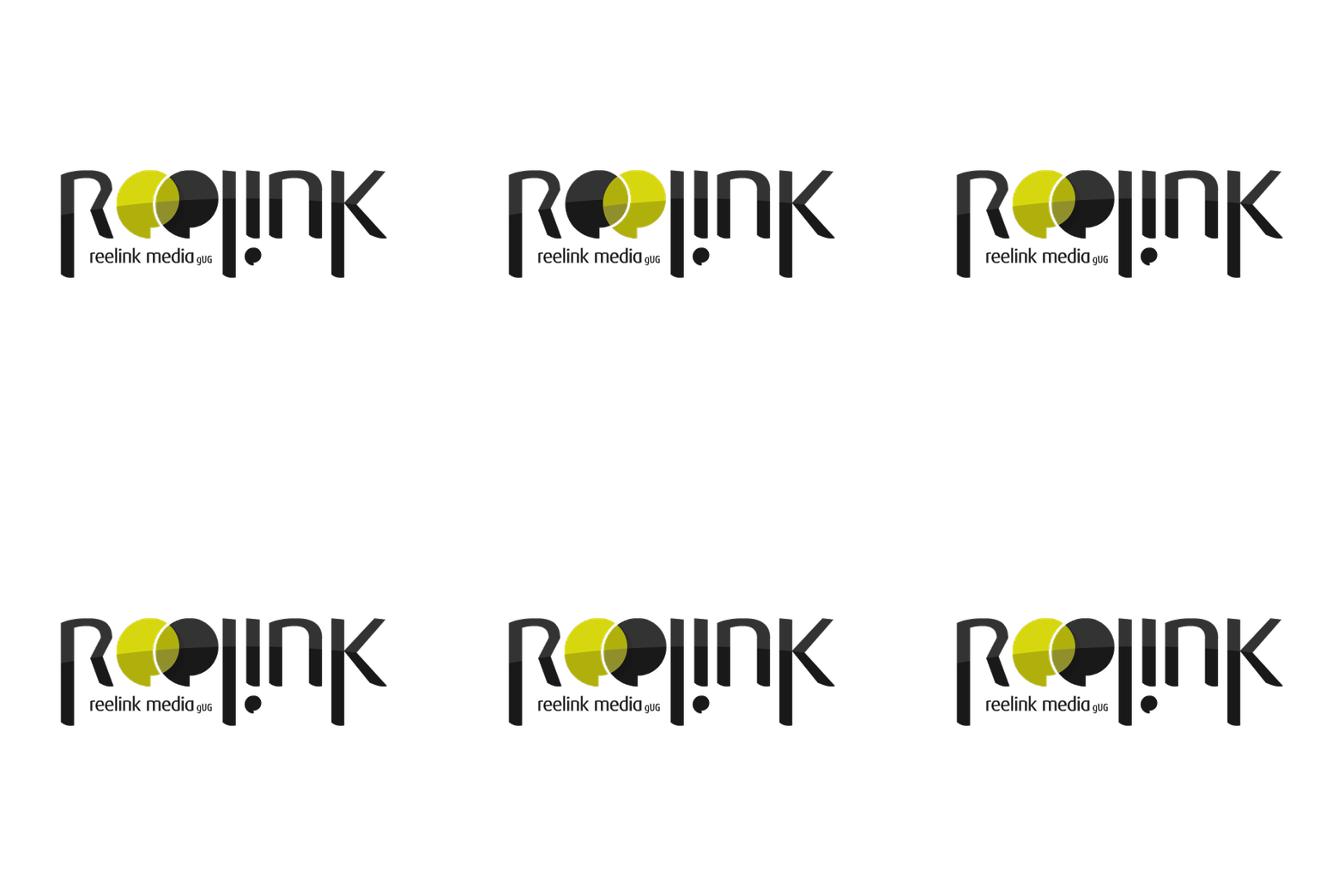
The conceptual breakthrough arrived by refining the dual "e" geometry into inter-penetrating speech bubbles and film reels. By applying selective vector opacity to the intersection zone, the mark achieves a dynamic optical link. The left form (rendered in lighter contrast) and the right form (anchored in solid dark tone) overlap to create a shared focal crescent. This solution visually articulates the brand's primary mission: connecting creators with audiences, blending sound with image, and linking creative concepts with precision execution.
reelink03
reelink04
vector construction & custom typography
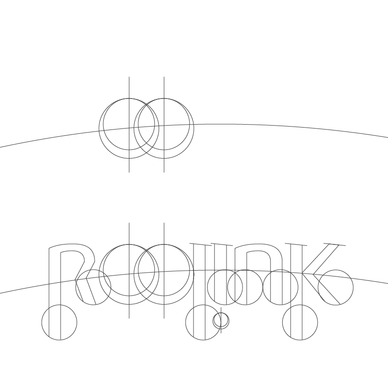
Translating the icon into a unified wordmark required strict typographic grid alignment. Utilizing structural curves derived from the baseline FF Dax geometry, the letterforms were customized to match the unique curvature of the centerpiece emblem. Curved alignment guides ensured the top arcs of the **"r"**, **"e"**, **"l"**, **"i"**, **"n"**, and **"k"** followed a continuous macro-radius across the horizontal span. This bespoke construction treats the entire wordmark as an integrated logotype, where every character shares the geometric DNA of the central "ee" icon.
final logotype masterwork
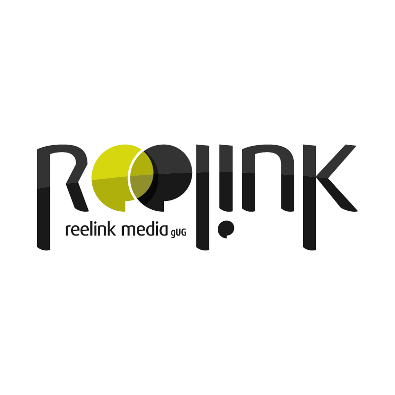
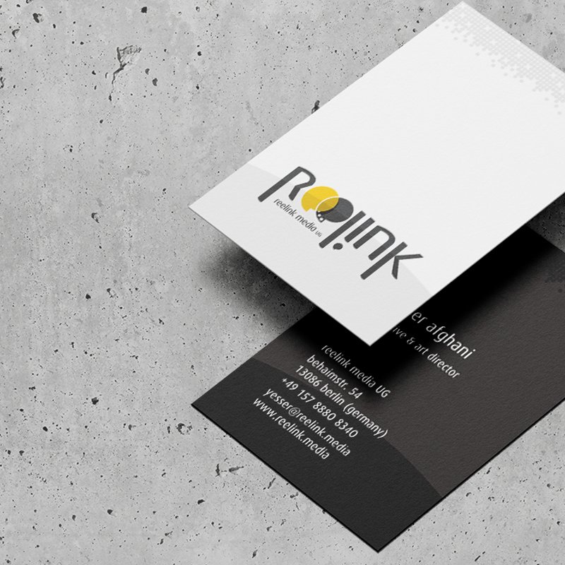
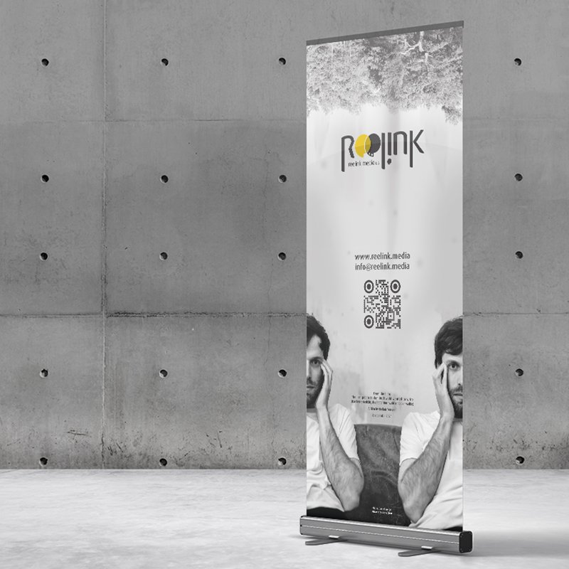
The final logotype presents a distinctive, highly modern signature for the Berlin production house. The customized letter stems display clean vertical rhythm, anchored by the high-contrast "ee" centerpiece in vibrant olive-lime and deep charcoal black. Subtle surface highlights across the letterforms give the mark a dynamic glass-like dimensionality, suitable for high-resolution video title cards and digital screen applications. Sub-text lockups accommodate legal descriptors ("reelink media UG") cleanly beneath the main wordmark, maintaining strict visual balance across all scales.
reelink05
reelink06
color palette architecture
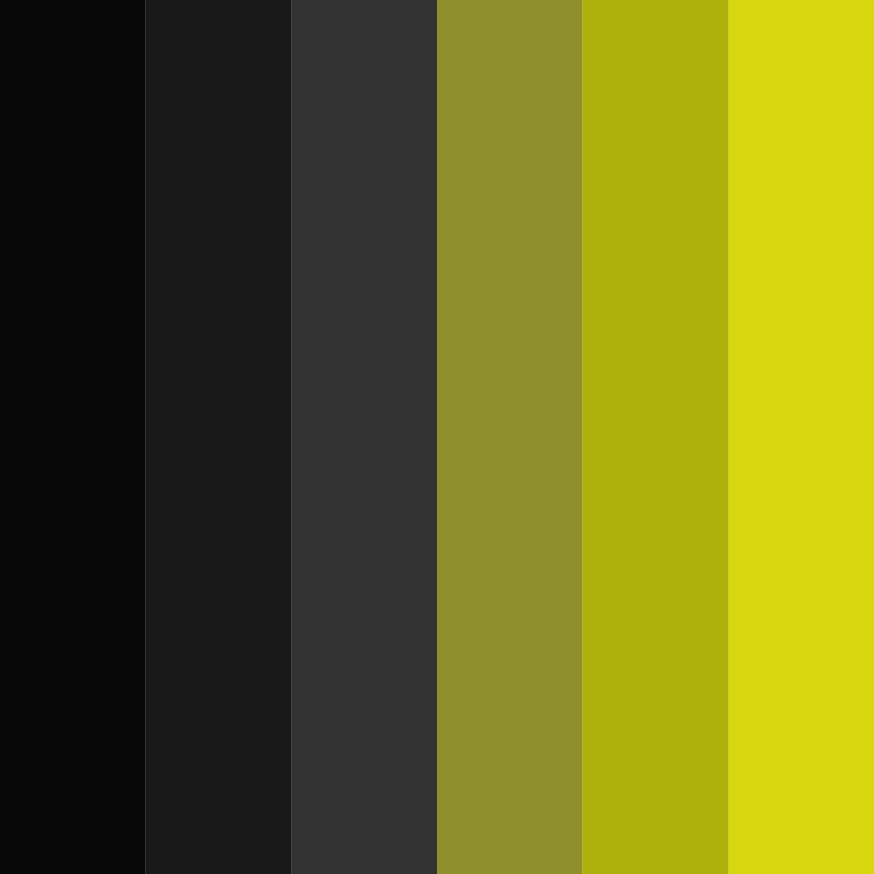
The color system balances modern artistic vibrancy with high-end corporate elegance. Olive / Lime Green Tones:** Symbolize vitality, innovation, growth, and commitment to social impact projects. Off-Black & Charcoal Grayscale:** Provide a sophisticated, grounded foundation that reflects professional production standards and cinema darkness. This high-contrast spectrum ensures the identity remains vibrant against light backdrops while holding strong contrast in dark screening environments and video UI overlays.
digital platform & art-first UX
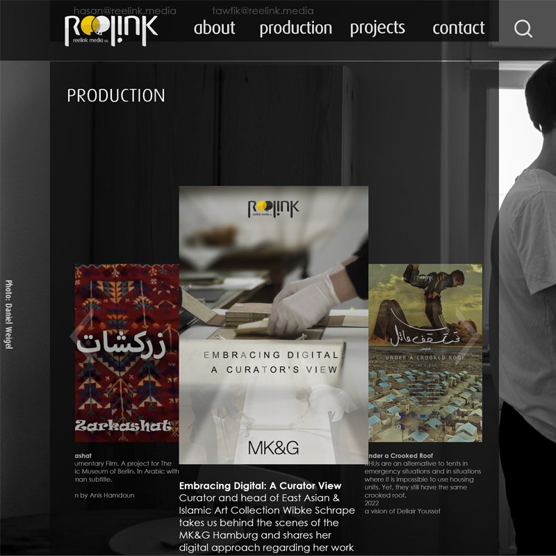
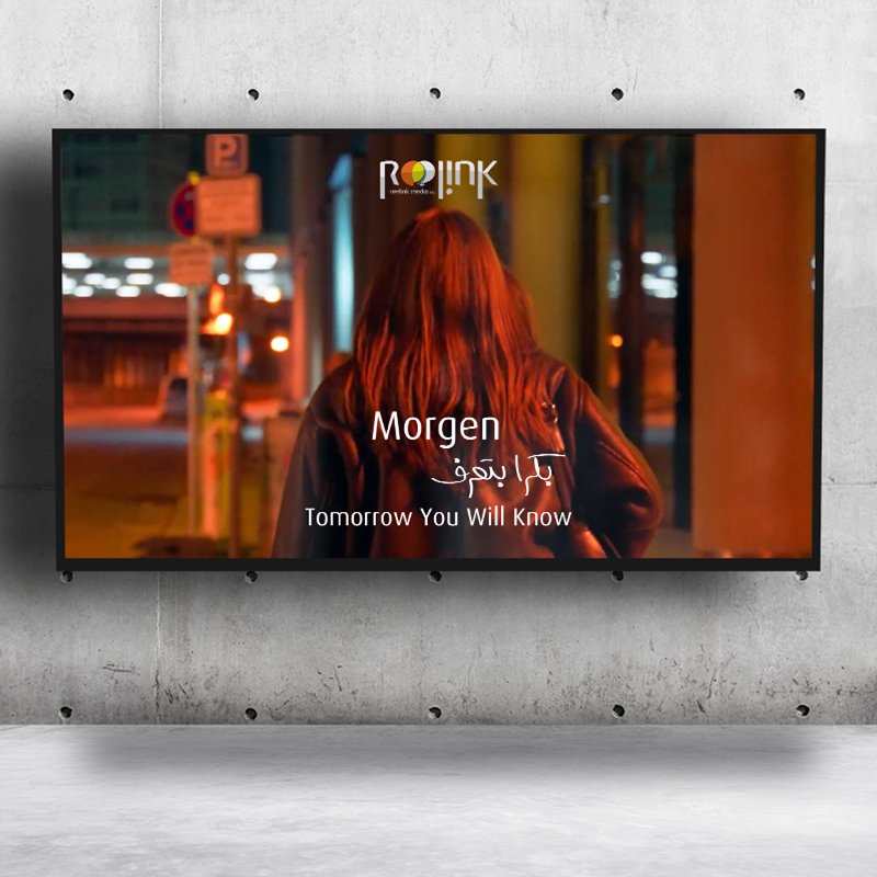
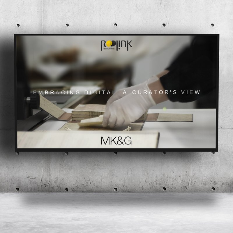
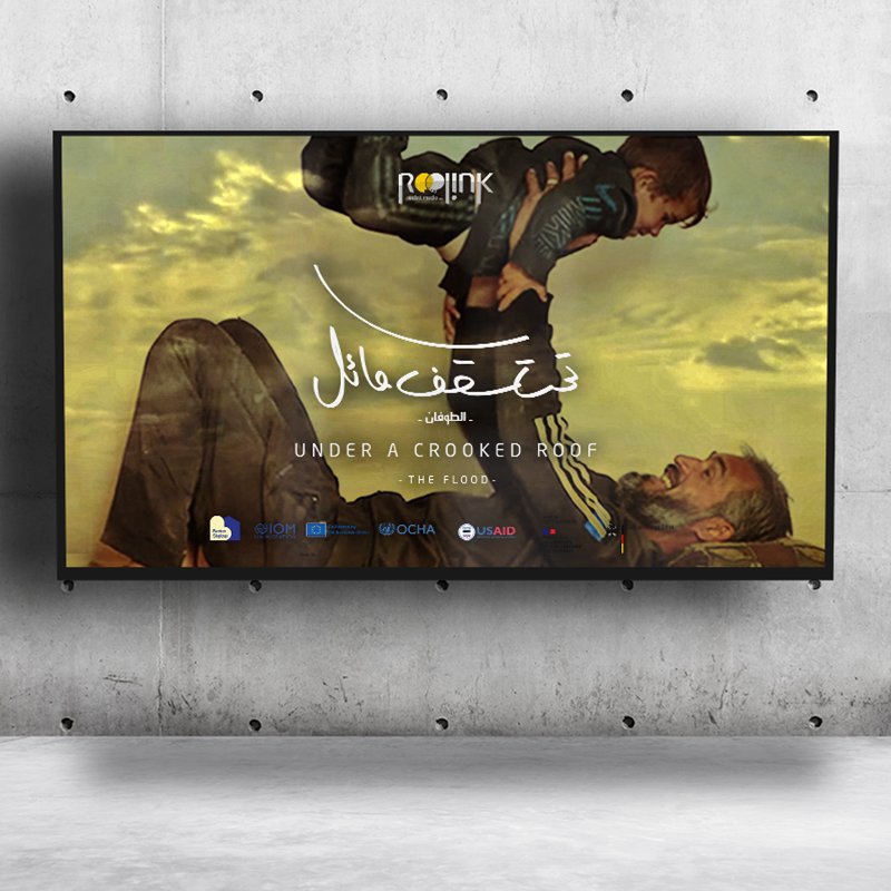
The web platform reimagines standard editorial layouts by prioritizing full-bleed visual showcase space. Designed with a vertical-split screen architecture, the UX affords maximum breathing room for featured documentaries, exhibition media, and cultural production assets. Rather than relying purely on conventional responsive grids, the UI provides an intuitive experience across desktop and mobile devices alike. Dark translucent overlay panels keep navigation crisp while allowing featured artwork and production stills to remain the focal point of the user experience.
reelink07

reelink media

2020
Berlin, Germany
strategic foundation & naming
Designing an identity for one's own company—the classic "designer syndrome"—requires stepping back to analyze core purpose objectifying intent. As a co-founding team member based in Berlin's vibrant multimedia production hub, the initial phase focused on defining mission scope: supporting independent artists, producing high-quality film, podcasting, and creating impact-driven media for good causes. This workshop phase yielded the brand name "reelink"—a seamless linguistic fusion of "reel" (audio/visual production) and "link" (connectivity and community). The sticky-note board established the foundational imperative: build a brand mark that visually embodies connection without compromising the independence of either element.
reelink01
early visual explorations
The exploration phase focused intensely on the central visual engine of the name: the twin letter "e"s in "reelink." Early draft iterations tested various geometric manifestations of interlock, transparency, and dialogue dynamics. Concepts ranged from speech bubbles and overlapping lens apertures to continuous loops and camera reels. Through these variations, the design target shifted toward capturing a dual state—two distinct shapes that merge to create a shared secondary space without obscuring their individual forms. This stage isolated the core motif: creating a link where the counter-spaces of the letterforms become the primary visual narrative.
reelink02
"eureka" resolving the core mark
The conceptual breakthrough arrived by refining the dual "e" geometry into inter-penetrating speech bubbles and film reels. By applying selective vector opacity to the intersection zone, the mark achieves a dynamic optical link. The left form (rendered in lighter contrast) and the right form (anchored in solid dark tone) overlap to create a shared focal crescent. This solution visually articulates the brand's primary mission: connecting creators with audiences, blending sound with image, and linking creative concepts with precision execution.
reelink03
vector construction & custom typography
Translating the icon into a unified wordmark required strict typographic grid alignment. Utilizing structural curves derived from the baseline FF Dax geometry, the letterforms were customized to match the unique curvature of the centerpiece emblem. Curved alignment guides ensured the top arcs of the **"r"**, **"e"**, **"l"**, **"i"**, **"n"**, and **"k"** followed a continuous macro-radius across the horizontal span. This bespoke construction treats the entire wordmark as an integrated logotype, where every character shares the geometric DNA of the central "ee" icon.
reelink04
final logotype masterwork
The final logotype presents a distinctive, highly modern signature for the Berlin production house. The customized letter stems display clean vertical rhythm, anchored by the high-contrast "ee" centerpiece in vibrant olive-lime and deep charcoal black. Subtle surface highlights across the letterforms give the mark a dynamic glass-like dimensionality, suitable for high-resolution video title cards and digital screen applications. Sub-text lockups accommodate legal descriptors ("reelink media UG") cleanly beneath the main wordmark, maintaining strict visual balance across all scales.
reelink05
color palette architecture
The color system balances modern artistic vibrancy with high-end corporate elegance. Olive / Lime Green Tones:** Symbolize vitality, innovation, growth, and commitment to social impact projects. Off-Black & Charcoal Grayscale:** Provide a sophisticated, grounded foundation that reflects professional production standards and cinema darkness. This high-contrast spectrum ensures the identity remains vibrant against light backdrops while holding strong contrast in dark screening environments and video UI overlays.
reelink06
digital platform & art-first UX
The web platform reimagines standard editorial layouts by prioritizing full-bleed visual showcase space. Designed with a vertical-split screen architecture, the UX affords maximum breathing room for featured documentaries, exhibition media, and cultural production assets. Rather than relying purely on conventional responsive grids, the UI provides an intuitive experience across desktop and mobile devices alike. Dark translucent overlay panels keep navigation crisp while allowing featured artwork and production stills to remain the focal point of the user experience.
reelink07

more insights about reelink media

more insights about reelink media