Salam

2027
Berlin, Germany
geometric analysis & formal refinement
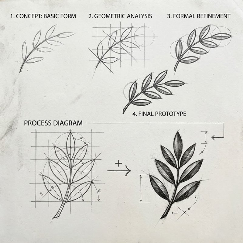
The initial concept underwent a rigorous geometric refinement process from the basic mapping organic leaf layouts along a curved central stem, throught the geometric analysis: for the grid structures and circular arcs to standardizing leaf curvatures and the formal refinementand balancing the arcs angles for symmetrical harmony till the final prototype and establishing an organic, structurally balanced branch unit ready for typographic integration.
salam01
salam02
final mark & bilingual lockup
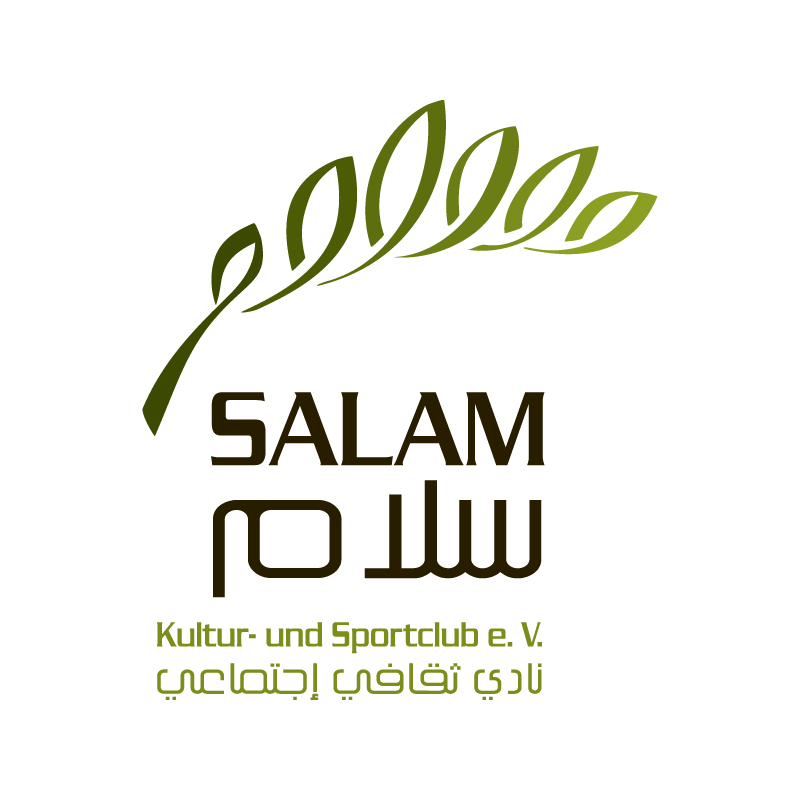
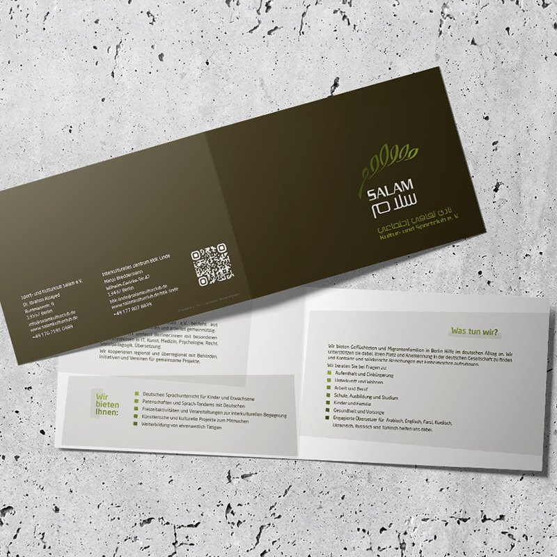
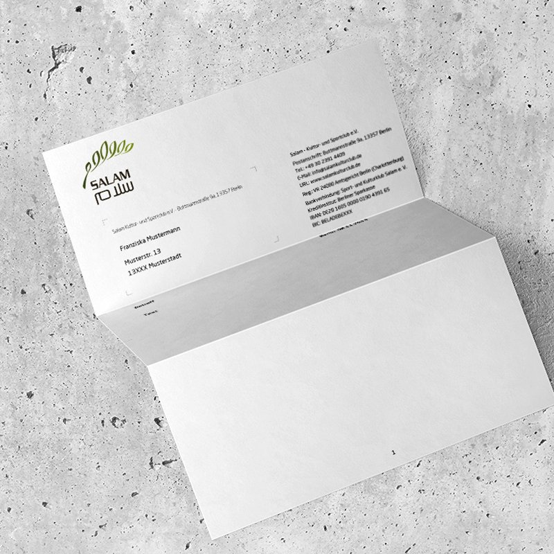
The finalized mark sweeps upward as an arching olive branch, whose leaf forms subtly echo Arabic calligraphic strokes. Below the emblem, the wordmark presents a unified bilingual lockup: German Typography: Bold, modern sans-serif logotype for "SALAM", mirrored by its Arabic counterpart (سلام). Sub-Titles: Clear secondary typography in both German (Kultur- und Sportclub e.V.) and Arabic (نادي ثقافي إجتماعي).
earth-toned color palette
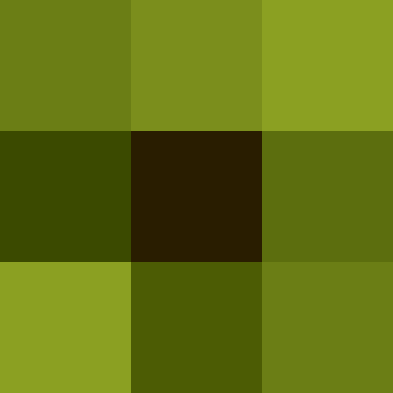
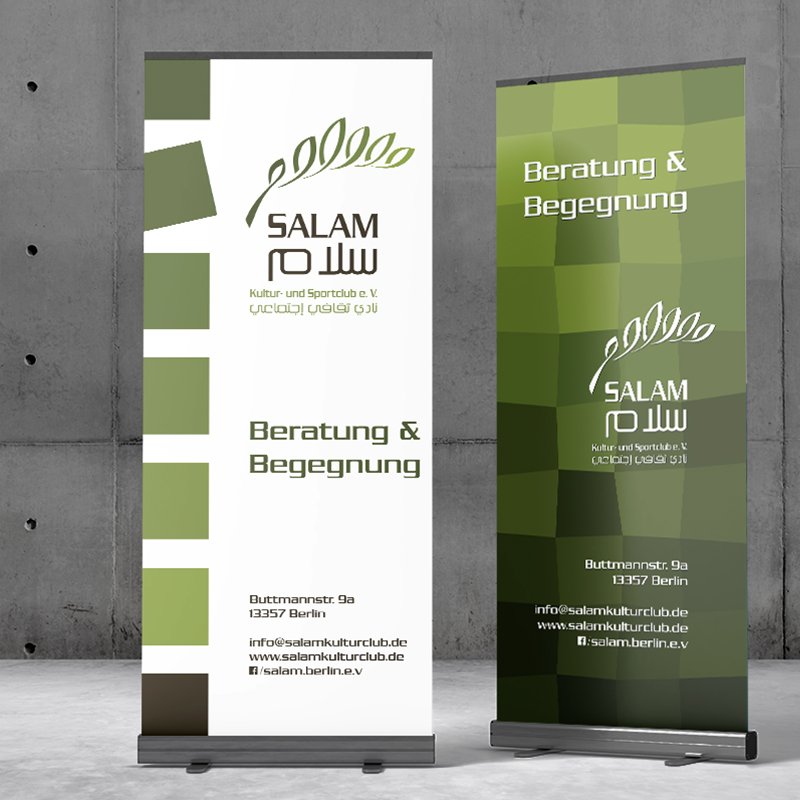
Inspired by natural landscapes, the brand palette avoids stark synthetic hues in favor of warm, organic tones: Olive Greens: Varied natural greens represent peace, vitality, hope, and social growth. Deep Earth Brown: Provides strong typographic contrast, grounding the identity in nature, stability, and enduring support.

salam03

Salam

2027
Berlin, Germany
geometric analysis & formal refinement
The initial concept underwent a rigorous geometric refinement process from the basic mapping organic leaf layouts along a curved central stem, throught the geometric analysis: for the grid structures and circular arcs to standardizing leaf curvatures and the formal refinementand balancing the arcs angles for symmetrical harmony till the final prototype and establishing an organic, structurally balanced branch unit ready for typographic integration.
salam01
final mark & bilingual lockup
The finalized mark sweeps upward as an arching olive branch, whose leaf forms subtly echo Arabic calligraphic strokes. Below the emblem, the wordmark presents a unified bilingual lockup: German Typography: Bold, modern sans-serif logotype for "SALAM", mirrored by its Arabic counterpart (سلام). Sub-Titles: Clear secondary typography in both German (Kultur- und Sportclub e.V.) and Arabic (نادي ثقافي إجتماعي).
salam02
earth-toned color palette
Inspired by natural landscapes, the brand palette avoids stark synthetic hues in favor of warm, organic tones: Olive Greens: Varied natural greens represent peace, vitality, hope, and social growth. Deep Earth Brown: Provides strong typographic contrast, grounding the identity in nature, stability, and enduring support.

salam03

more insights about Salam

more insights about Salam