Syrbanism

2026
Berlin, German
early sketches & conceptual synthesis
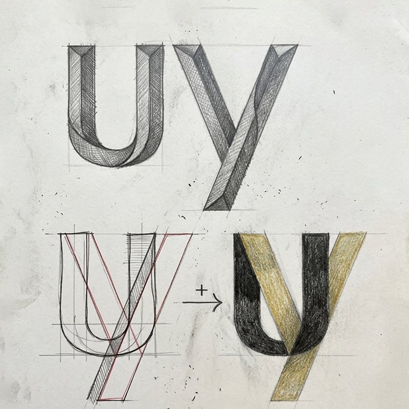
Syrbanism is a nonprofit organization operating at the intersection of urban design, political architecture, and social justice in Syria. Because the organization was founded by architects, the design process demanded rigorous precision, structural alignment, and intense attention to detail. The conceptual core emerged directly from the portmanteau name—fusing "Syria" and "Urbanism". Early hand-sketches focused on synthesizing the letterforms "u" and "y" into a singular architectural ligature, overlaying geometric stems to establish a unified visual foundation.
syrbamism01
syrbamism02
proportional study & architectural geometry
To satisfy the technical expectations of an architectural team, the ligature underwent precise proportional grid analysis. The structural study maps the exact convergence of the black U-stem shading and the angled gold-yellow stroke. By calculating the angles, stroke weights, and intersection points, the geometric synthesis balances two distinct characters into one seamless structural glyph.
typography & visual lockup
The finalized wordmark translates the architectural sketch into a custom, modern logotype. The custom **u/y** glyph seamlessly bridges the first two letters, featuring a bright yellow diagonal slash that dynamically cuts through the character. The typography uses rounded sans-serif letterforms, complemented by a subtle diamond accent over the letter "i" to balance structural clarity with approachable, community-centered design.
syrbanism03
syrbanism04
color system
The color palette uses a high-contrast, two-tone palette engineered for architectural clarity and visual impact: Off-Black: Delivers a grounded, sophisticated background tone representing structure, technical rigor, and urban foundations. Sunflower Yellow: Injects energy, optimism, and warmth, highlighting community agency and forward-looking social change.


Syrbanism

2026
Berlin, German
early sketches & conceptual synthesis
Syrbanism is a nonprofit organization operating at the intersection of urban design, political architecture, and social justice in Syria. Because the organization was founded by architects, the design process demanded rigorous precision, structural alignment, and intense attention to detail. The conceptual core emerged directly from the portmanteau name—fusing "Syria" and "Urbanism". Early hand-sketches focused on synthesizing the letterforms "u" and "y" into a singular architectural ligature, overlaying geometric stems to establish a unified visual foundation.
syrbamism01
proportional study & architectural geometry
To satisfy the technical expectations of an architectural team, the ligature underwent precise proportional grid analysis. The structural study maps the exact convergence of the black U-stem shading and the angled gold-yellow stroke. By calculating the angles, stroke weights, and intersection points, the geometric synthesis balances two distinct characters into one seamless structural glyph.
syrbamism02
typography & visual lockup
The finalized wordmark translates the architectural sketch into a custom, modern logotype. The custom **u/y** glyph seamlessly bridges the first two letters, featuring a bright yellow diagonal slash that dynamically cuts through the character. The typography uses rounded sans-serif letterforms, complemented by a subtle diamond accent over the letter "i" to balance structural clarity with approachable, community-centered design.
syrbanism03
color system
The color palette uses a high-contrast, two-tone palette engineered for architectural clarity and visual impact: Off-Black: Delivers a grounded, sophisticated background tone representing structure, technical rigor, and urban foundations. Sunflower Yellow: Injects energy, optimism, and warmth, highlighting community agency and forward-looking social change.
syrbanism04

more insights about Syrbanism

more insights about Syrbanism