Peace Circuit

2023
Damascus, Syria
ideation & circular geometry
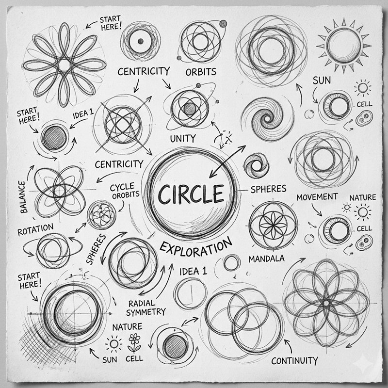
Peace Circuit is a civil society organization dedicated to establishing safe digital spaces for women across the Arab world. The primary design challenge was creating a tech-focused identity while strictly avoiding visual clichés or gender stereotypes in symbols and color choices. Initial sketches explored circular concepts: orbits, rotation, radial symmetry, continuity, and interconnected nodes. The circle was chosen as the foundational geometric framework, symbolizing safe digital perimeters, unity, and continuous electronic circuits.
paxc01
paxc02
typographic synthesis & deconstruction
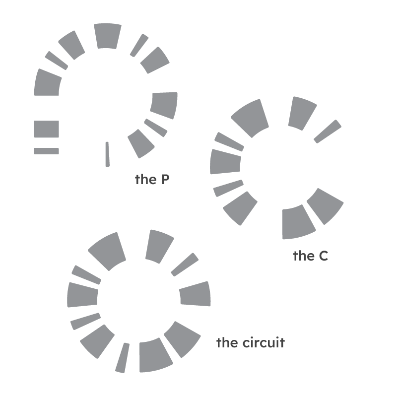
The visual system deconstructs the brand's initials into modular, fragmented segments: The P: Formed by an arched upper loop and extended vertical tail segment. The C: Derived from an open, sweeping arc of segmented blocks. The Circuit: Merges these elements into a complete radial loop. Because the organization operates entirely in the digital realm, this fragmented structure was specifically engineered for dynamic motion, allowing individual pieces to animate, rotate, and assemble across digital touchpoints.
final mark & brand lockup
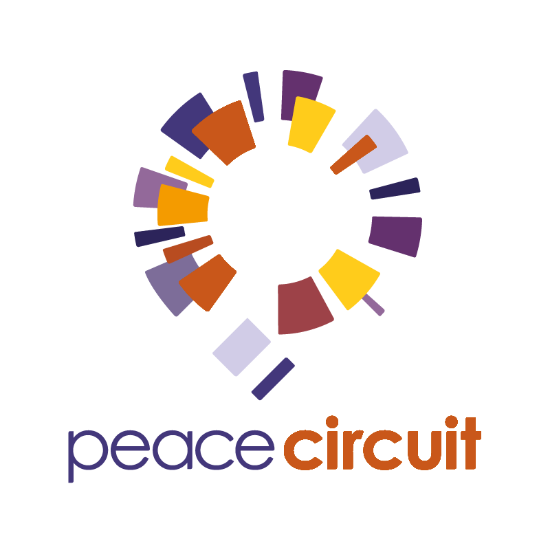
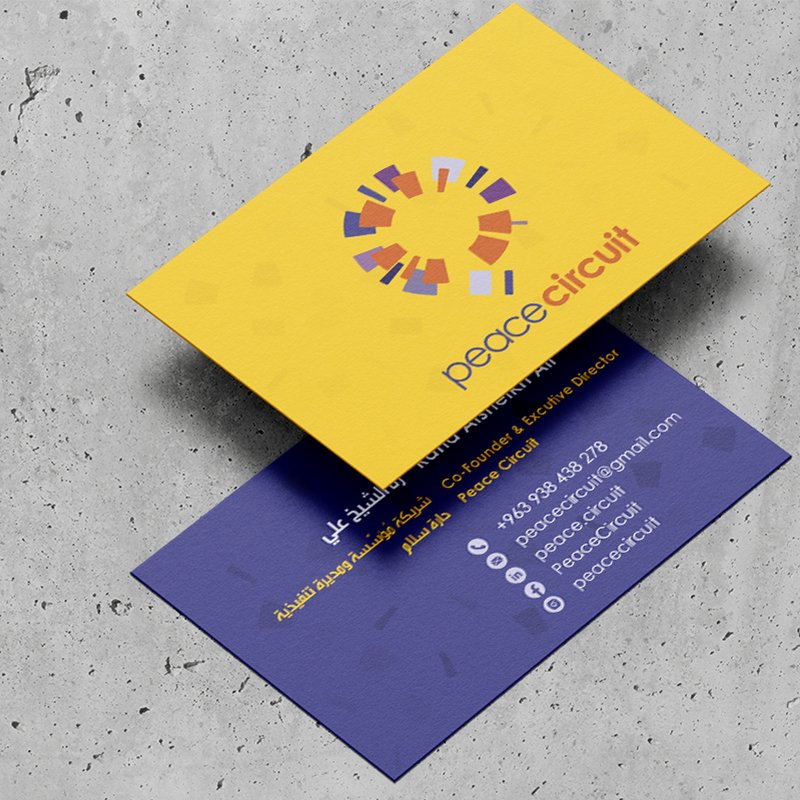
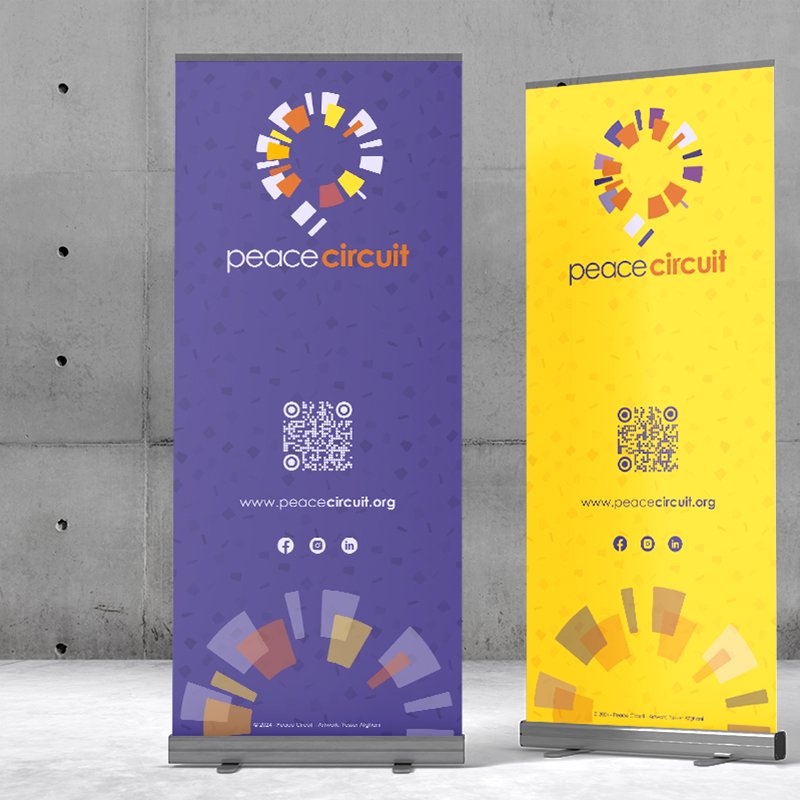
The finalized emblem merges the letterforms **P** and **C** into a vibrant, multi-layered circular circuit. Individual geometric blocks float in radial formation, representing safe individual nodes coming together to form a collective digital sanctuary. The accompanying wordmark uses a clean, modern sans-serif typeface in lower case, balancing the lower-case **peace** in deep indigo alongside a bold, warm **circuit** in rust orange.
paxc03
paxc04
color system
The brand palette intentionally rejects stereotypical gendered colors in favor of an energetic, sophisticated high-contrast spectrum: Cool Spectrum (Indigo, Lavender, Muted Violet): Represents digital security, tech sophistication, trust, and calm protection. Warm Spectrum (Golden Yellow, Warm Amber, Rust Orange, Terracotta): Infuses human warmth, optimism, vitality, and empowerment. This dual-gradient system enables rich contrast across digital platforms and dark-mode web layouts.

digital interface & web platform
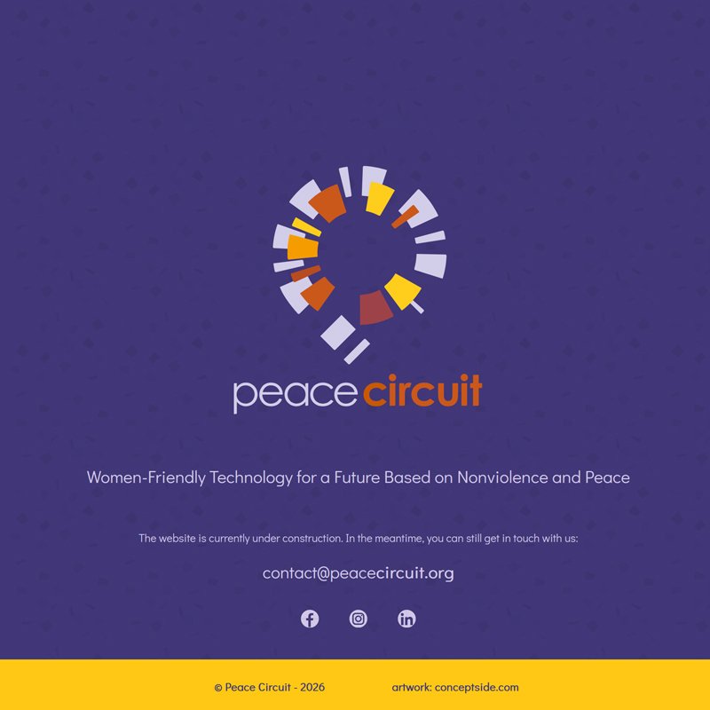
The digital landing interface translates the visual identity directly into a sleek, dark-mode web layout. Built over a deep violet textured background, the glowing radial circuit emblem serves as the hero focal point. The splash page communicates the core mission: *"Women-Friendly Technology for a Future Based on Nonviolence and Peace."* Clean typography, clear contact channels, and vibrant yellow accent bars reinforce a safe, modern, and accessible digital portal.
paxc05

Peace Circuit

2023
Damascus, Syria
ideation & circular geometry
Peace Circuit is a civil society organization dedicated to establishing safe digital spaces for women across the Arab world. The primary design challenge was creating a tech-focused identity while strictly avoiding visual clichés or gender stereotypes in symbols and color choices. Initial sketches explored circular concepts: orbits, rotation, radial symmetry, continuity, and interconnected nodes. The circle was chosen as the foundational geometric framework, symbolizing safe digital perimeters, unity, and continuous electronic circuits.
paxc01
typographic synthesis & deconstruction
The visual system deconstructs the brand's initials into modular, fragmented segments: The P: Formed by an arched upper loop and extended vertical tail segment. The C: Derived from an open, sweeping arc of segmented blocks. The Circuit: Merges these elements into a complete radial loop. Because the organization operates entirely in the digital realm, this fragmented structure was specifically engineered for dynamic motion, allowing individual pieces to animate, rotate, and assemble across digital touchpoints.
paxc02
final mark & brand lockup
The finalized emblem merges the letterforms **P** and **C** into a vibrant, multi-layered circular circuit. Individual geometric blocks float in radial formation, representing safe individual nodes coming together to form a collective digital sanctuary. The accompanying wordmark uses a clean, modern sans-serif typeface in lower case, balancing the lower-case **peace** in deep indigo alongside a bold, warm **circuit** in rust orange.
paxc03
color system
The brand palette intentionally rejects stereotypical gendered colors in favor of an energetic, sophisticated high-contrast spectrum: Cool Spectrum (Indigo, Lavender, Muted Violet): Represents digital security, tech sophistication, trust, and calm protection. Warm Spectrum (Golden Yellow, Warm Amber, Rust Orange, Terracotta): Infuses human warmth, optimism, vitality, and empowerment. This dual-gradient system enables rich contrast across digital platforms and dark-mode web layouts.

paxc04
digital interface & web platform
The digital landing interface translates the visual identity directly into a sleek, dark-mode web layout. Built over a deep violet textured background, the glowing radial circuit emblem serves as the hero focal point. The splash page communicates the core mission: *"Women-Friendly Technology for a Future Based on Nonviolence and Peace."* Clean typography, clear contact channels, and vibrant yellow accent bars reinforce a safe, modern, and accessible digital portal.
paxc05

more insights about Peace Circuit

more insights about Peace Circuit